
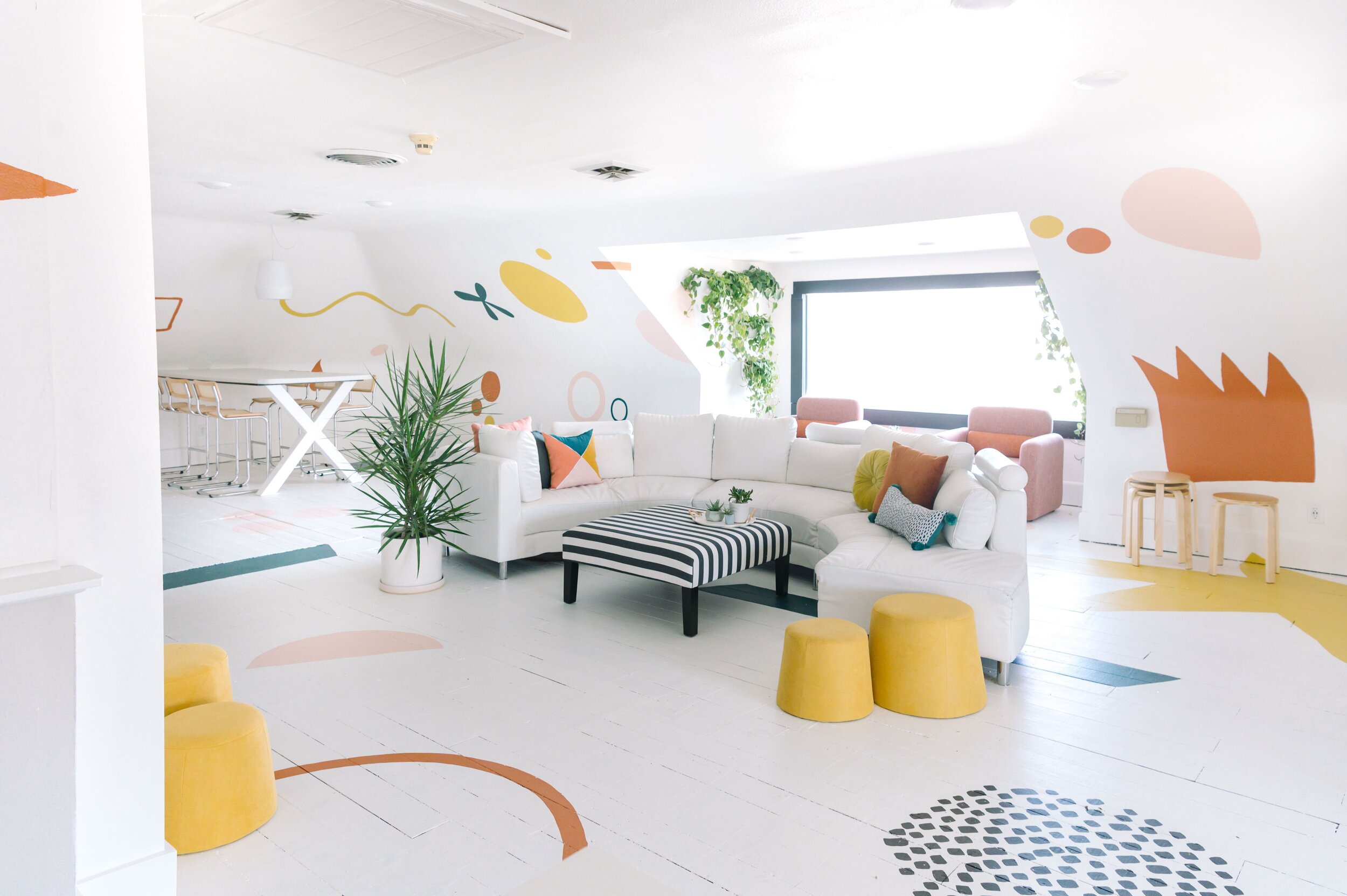
At Home With Our Designers: Picture Ledge How-To With Holly
Here's what you need to know before you make plan your gallery wall.
Here's what you need to know before you make you plan your art gallery wall.
A colorful and curated art gallery wall can bring life to any space. They're often rich in color and pattern and celebrated as a statement piece. Yet they can also function as a home to special memories and complement many different aesthetics, even the more minimalistic. How do you know what to look for when selecting shelves for your wall or better yet, how do you style your shelves? To answer these questions and more, we tapped our lead designer, Holly. Here, she guides us through the pursuit of the perfect wall, from her home to yours!
Holly’s passion for creating beautiful spaces is reflected in the overwhelming feeling of happiness you get when you enter her home. Perfectly kept Pothos, Philodendron, and Snake Plants burst with color, and every corner is beautifully styled with vintage and eclectic decor. It was such a pleasure to sit down with her and talk style, design, and her own future DIY projects, which I will be sharing with you all in the upcoming weeks. Here’s her guide to doing your own gallery wall at home.
IT’S ALL ABOUT PRACTICALITY
Q1: How did you come up with the idea to utilize a bare wall like an art gallery wall?
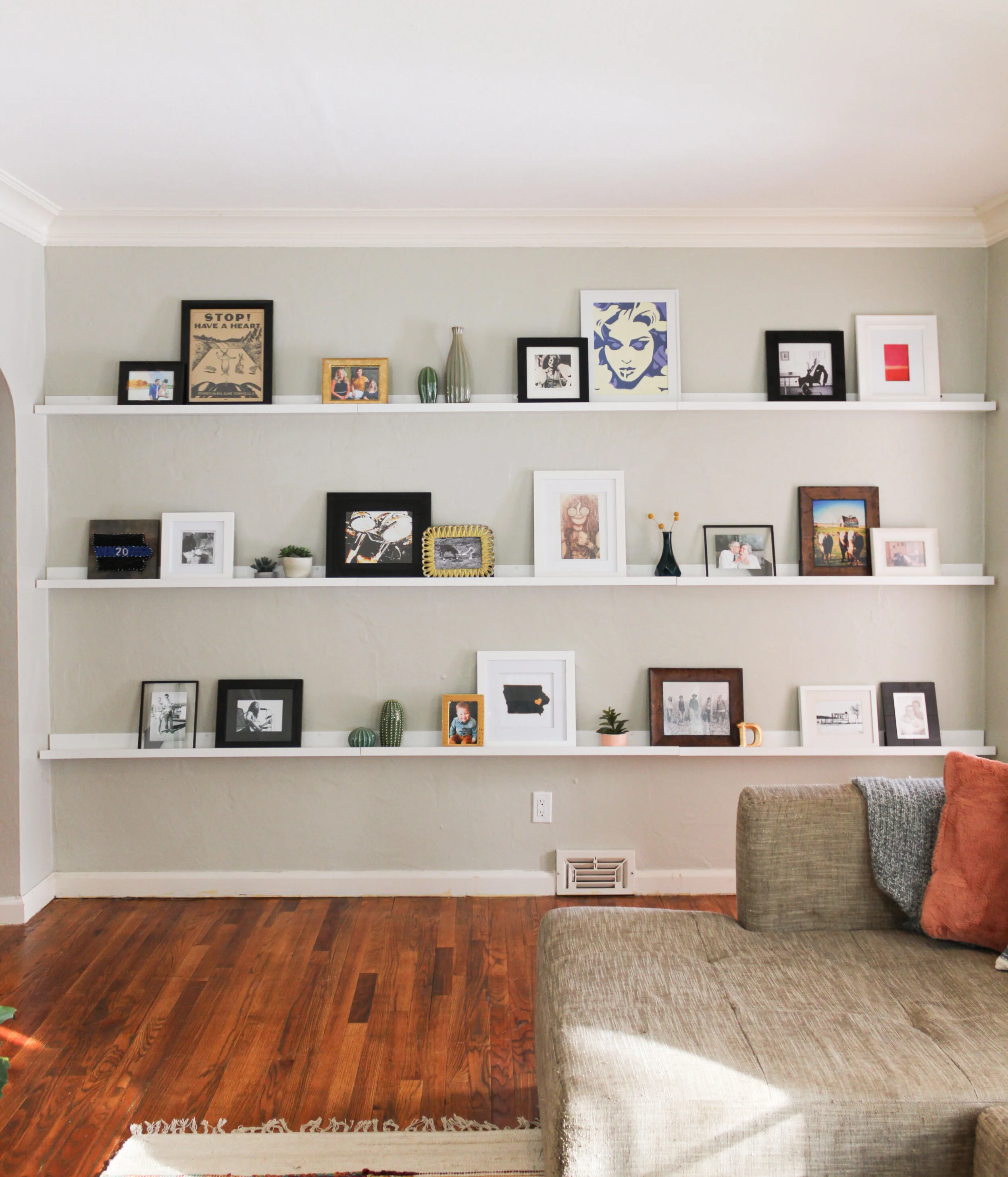
Holly: Collage gallery walls can be challenging in that they require a thought out wall arrangement and take a tedious time to measure and hang for the perfect spacing. This art shelf allows art to be instantly interchanged and arranged without the headache of nail holes!
MEASURE YOUR WALL
Q2: Tell us a bit about the process of finding the right shelves and mounting.
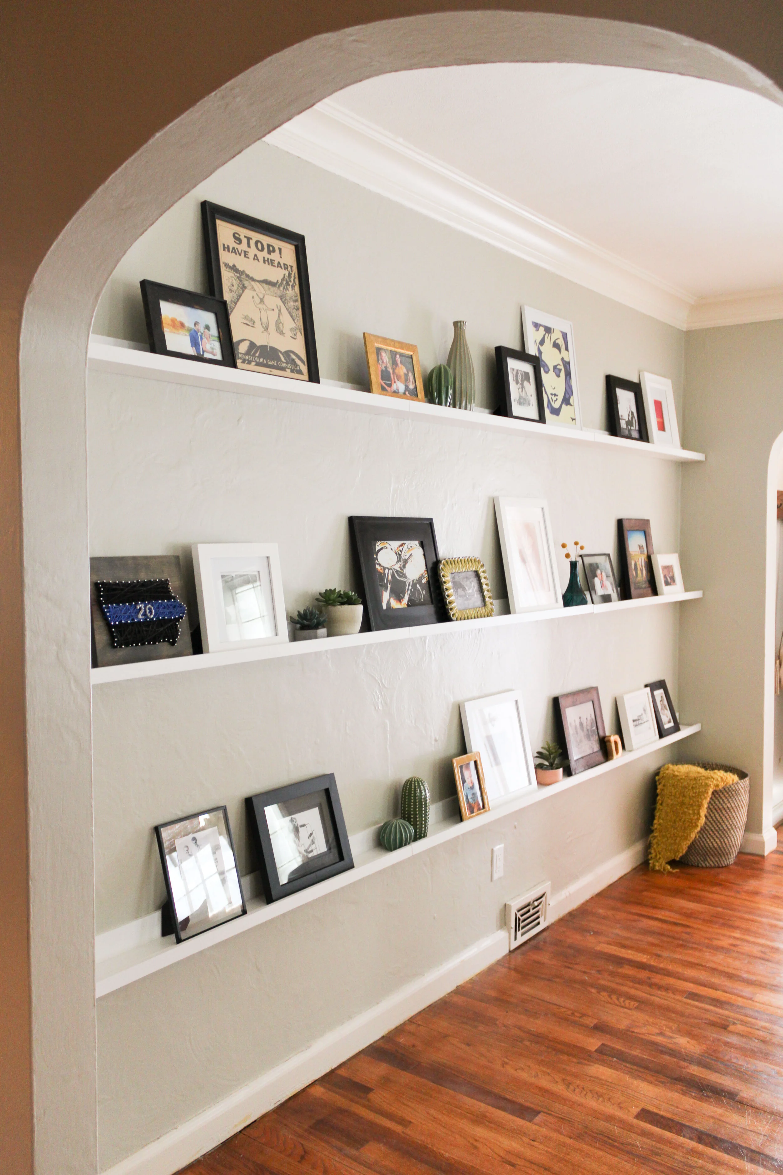
Start by measuring your wall so you can get an idea of what type of shelves and sizes are appropriate for your wall. These shelves from IKEA come in a variety of widths which made it easy to pair the exact sizes to span the whole wall for a custom-built look. Installation only requires a hand drill, a level, and some patience.
Mix and Match
Q3: What are some easy tips for decorating shelves like a pro?
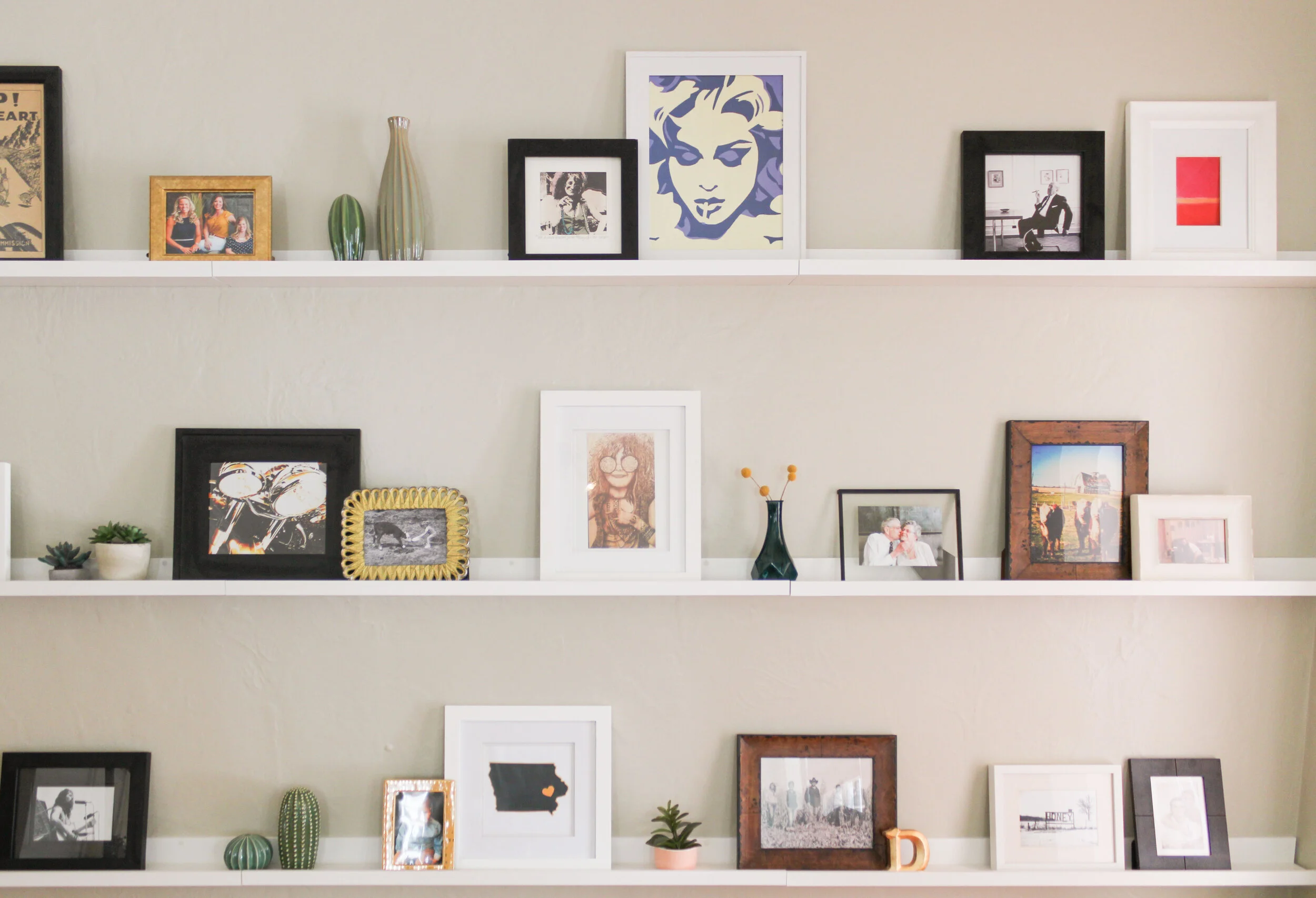
Pick a frame color combination/scheme and stick with it. Black and white frames are always a good choice. I mixed in a few gold frames as an accent color. Wood frames of the same stain or contrasting colors also work well. Select frames in a variety of sizes and artwork of both horizontal and vertical orientation. To finish off a great shelf art gallery; mix in object accessories- live plants or handmade items always make a statement.
A REFLECTION OF YOU
Q4: Out of all the pieces on your shelves, which is your favorite?
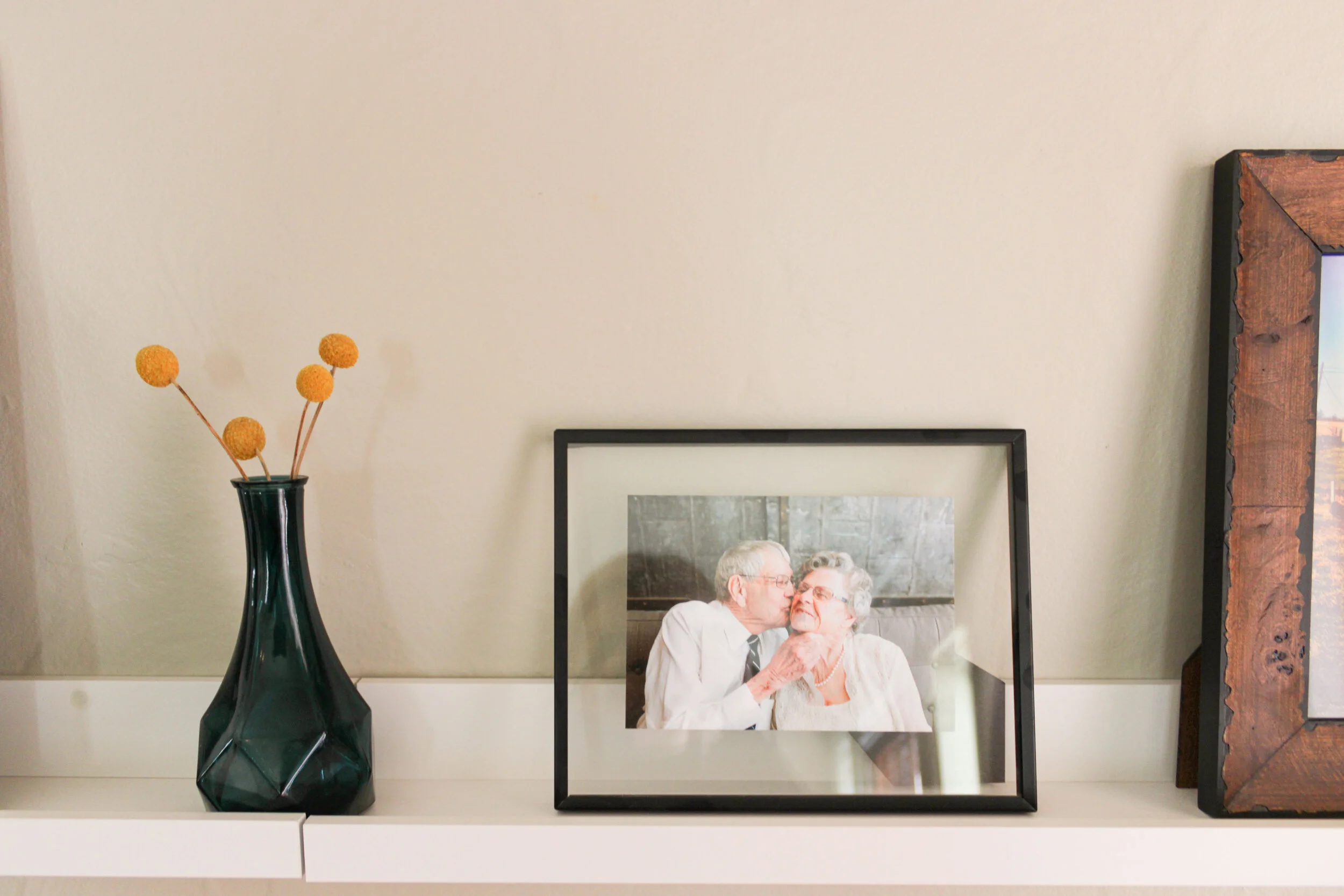
Art displays are very personal in that they highlight one's taste and interests in art or memories of places traveled, but I would say that most people enjoy showcasing their family the most. It is true for me as well, my favorite picture on my shelves is an adorable moment shared by my grandparents. This was the last photo ever taken of them together as my grandfather passed two months after that photo was taken, a treasure captured. :)
Special thanks to Holly for opening up her beautiful home to us. Next week we’ll have another guide from our designers at home so be sure to stay tuned!
Behind The Scenes: 1000 & 1010 Daybreak
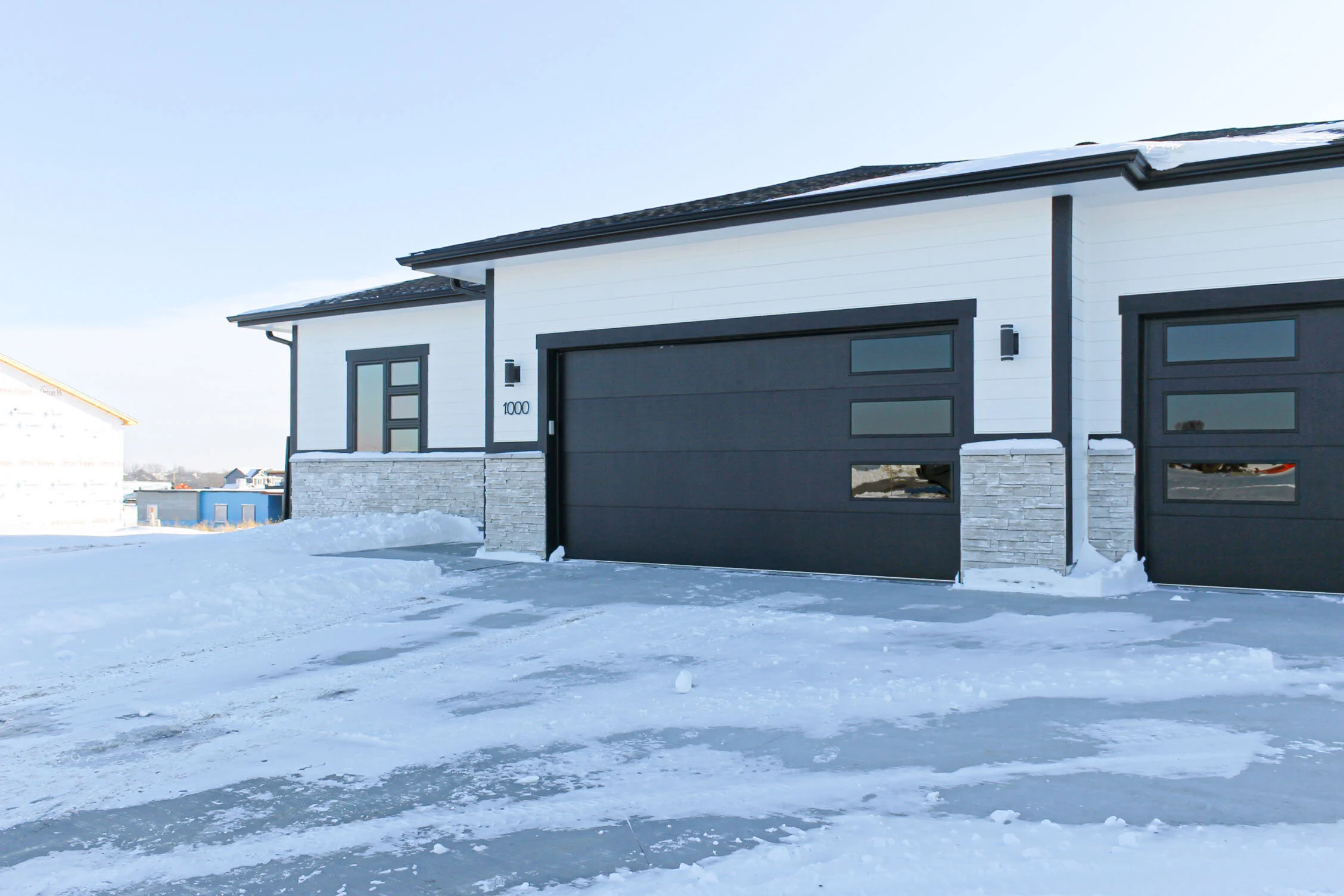
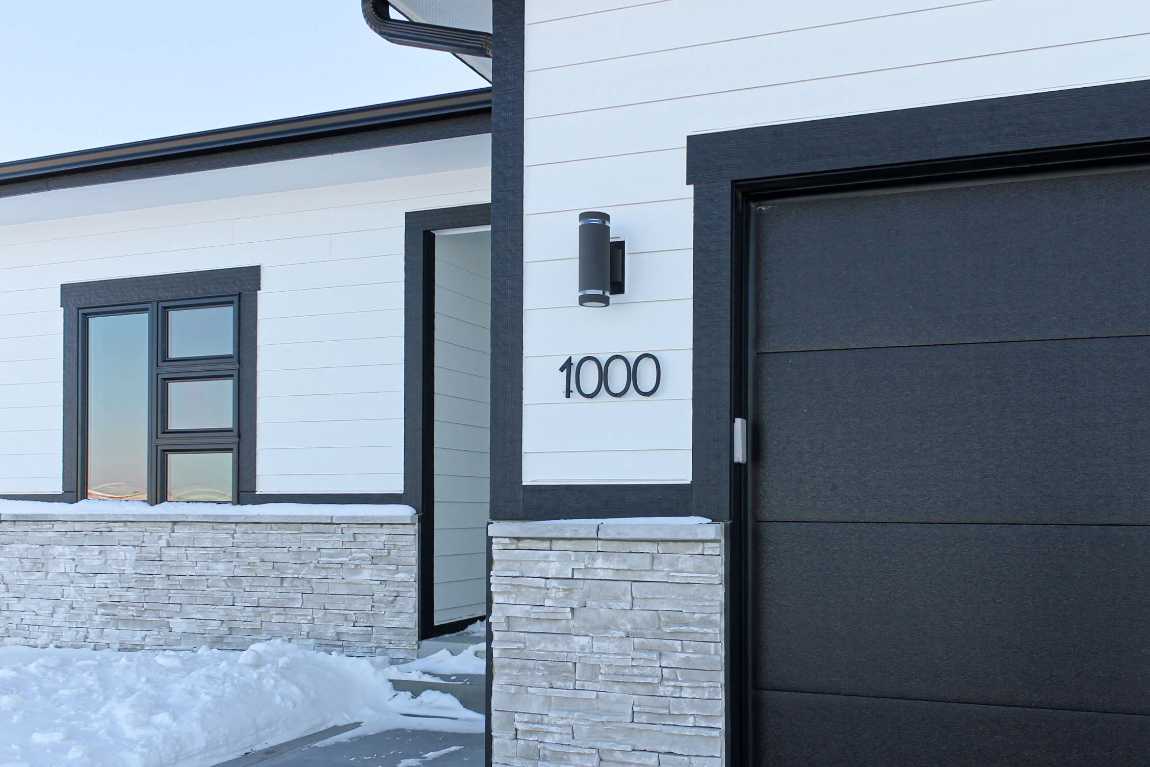
Happy Monday everyone, hope everyone is having a fantastic start to the New Year! Back at the office, we are chugging along with several new construction and remodel projects. This week, we are sharing a behind-the-scenes look at 1000 and 1010 Daybreak Dr.
Although these two homes were actually built right next to each other, they couldn’t be more different in style and vibe. We will be sharing our design inspiration for both properties as well as a sourcing list!

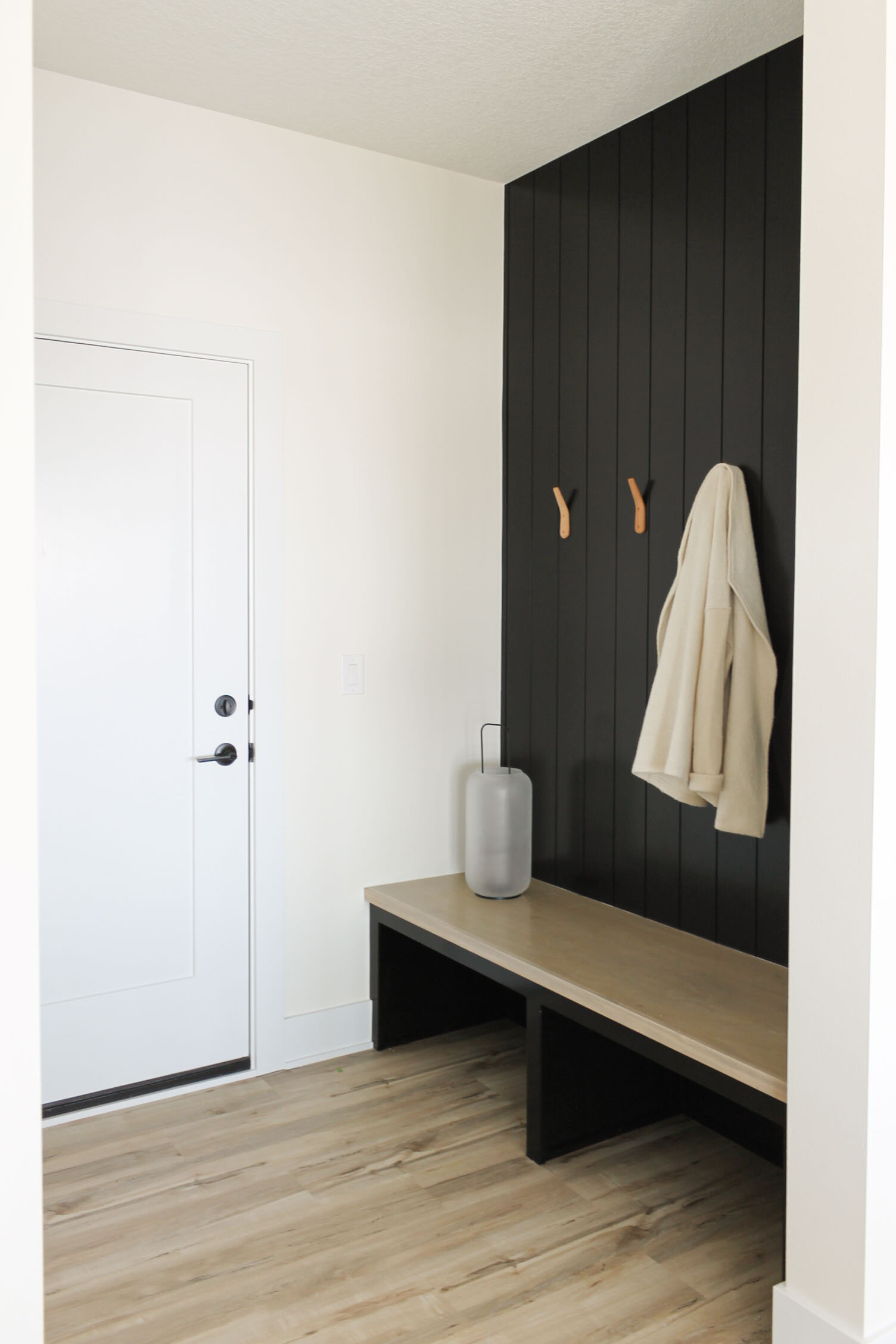
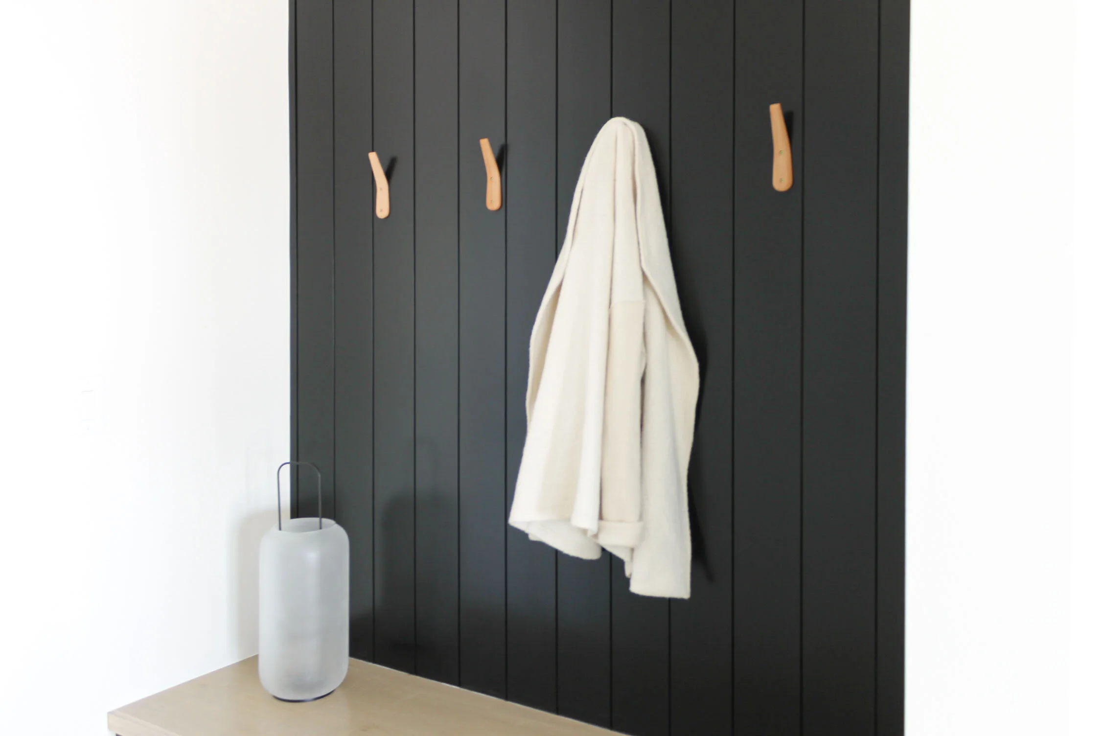
1000 Daybreak Mudroom Hangers

1000 Daybreak Kitchen Before

1000 Daybreak Livingroom Before
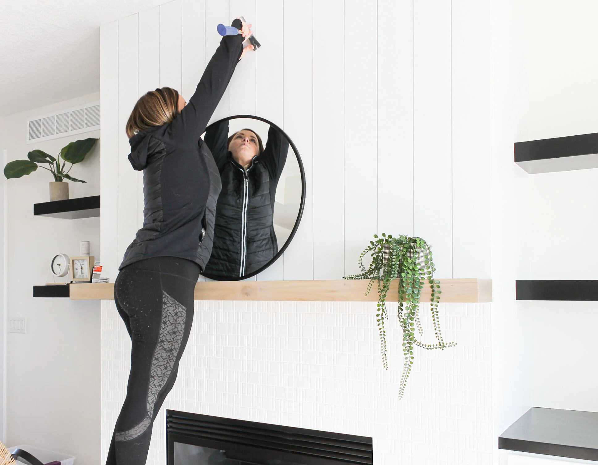
Designer Holly Installing Fireplace Mirror
1000 DAYBREAK DESIGN STYLE
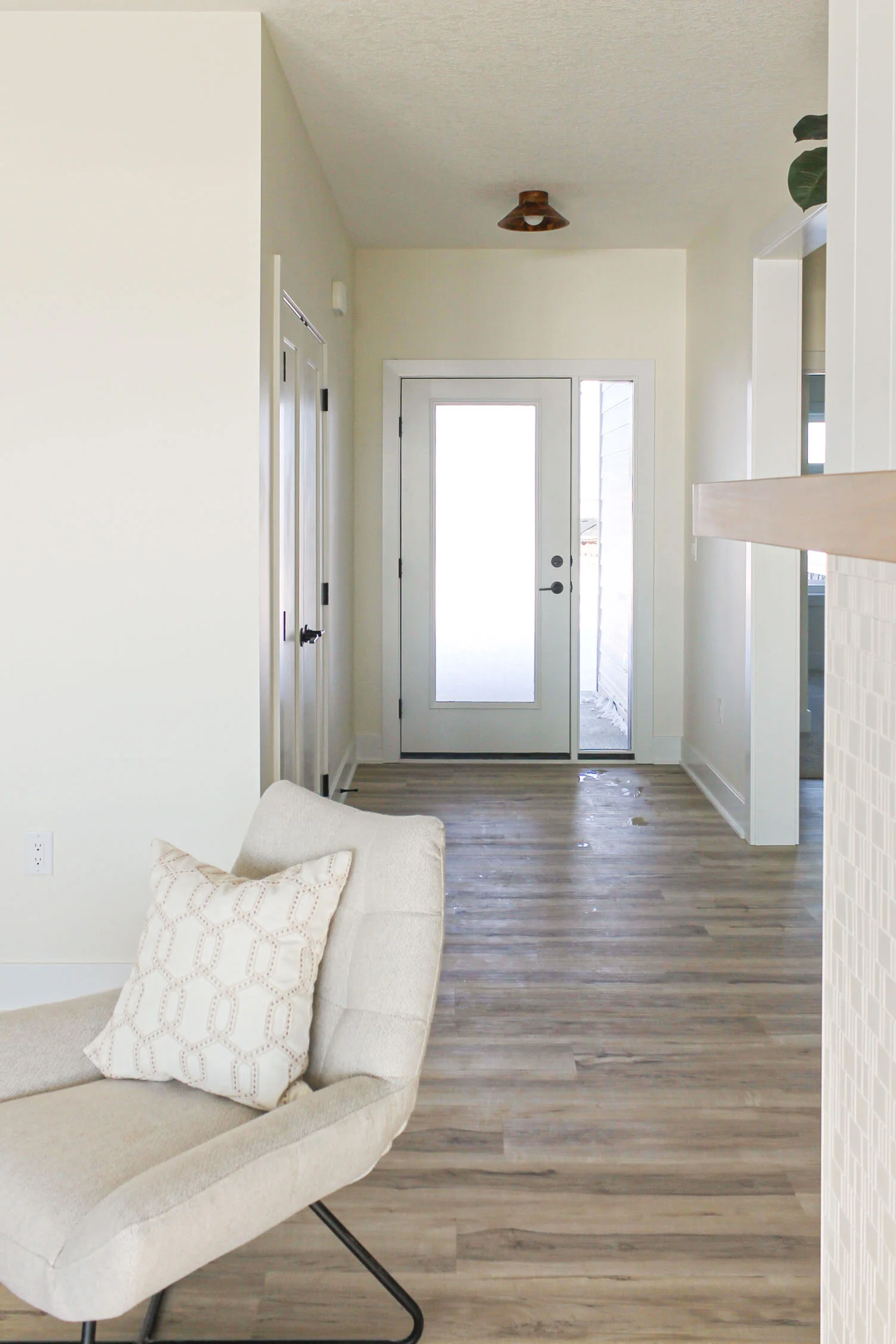
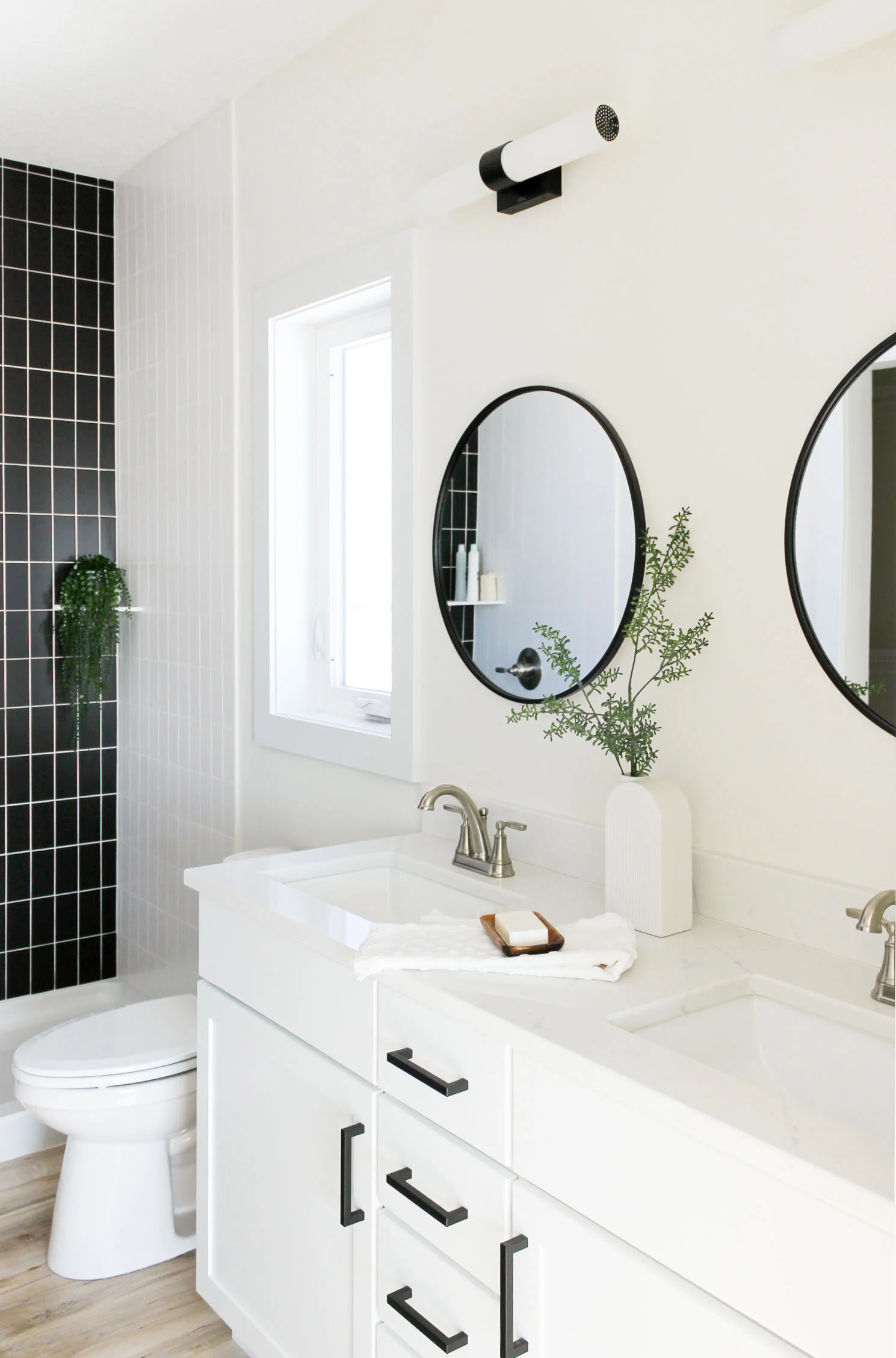
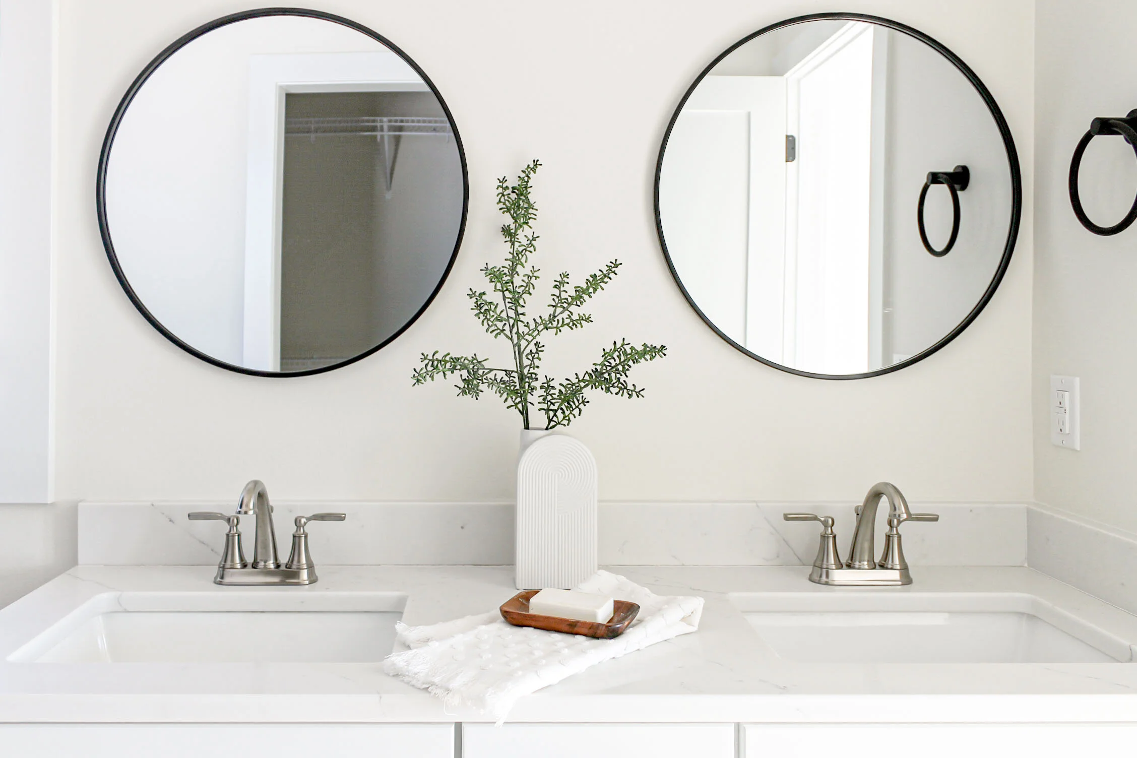
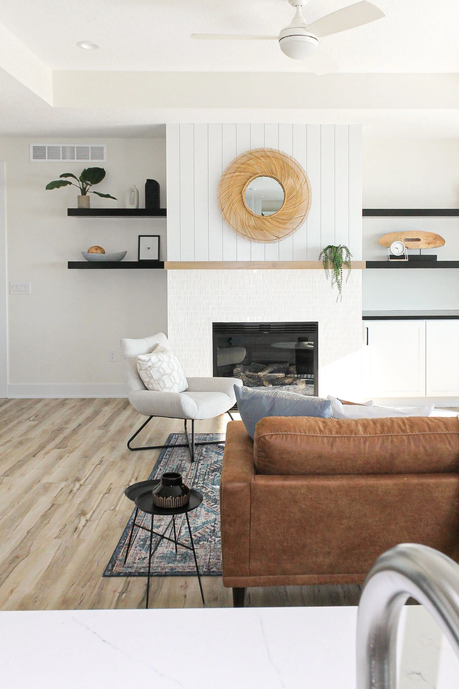
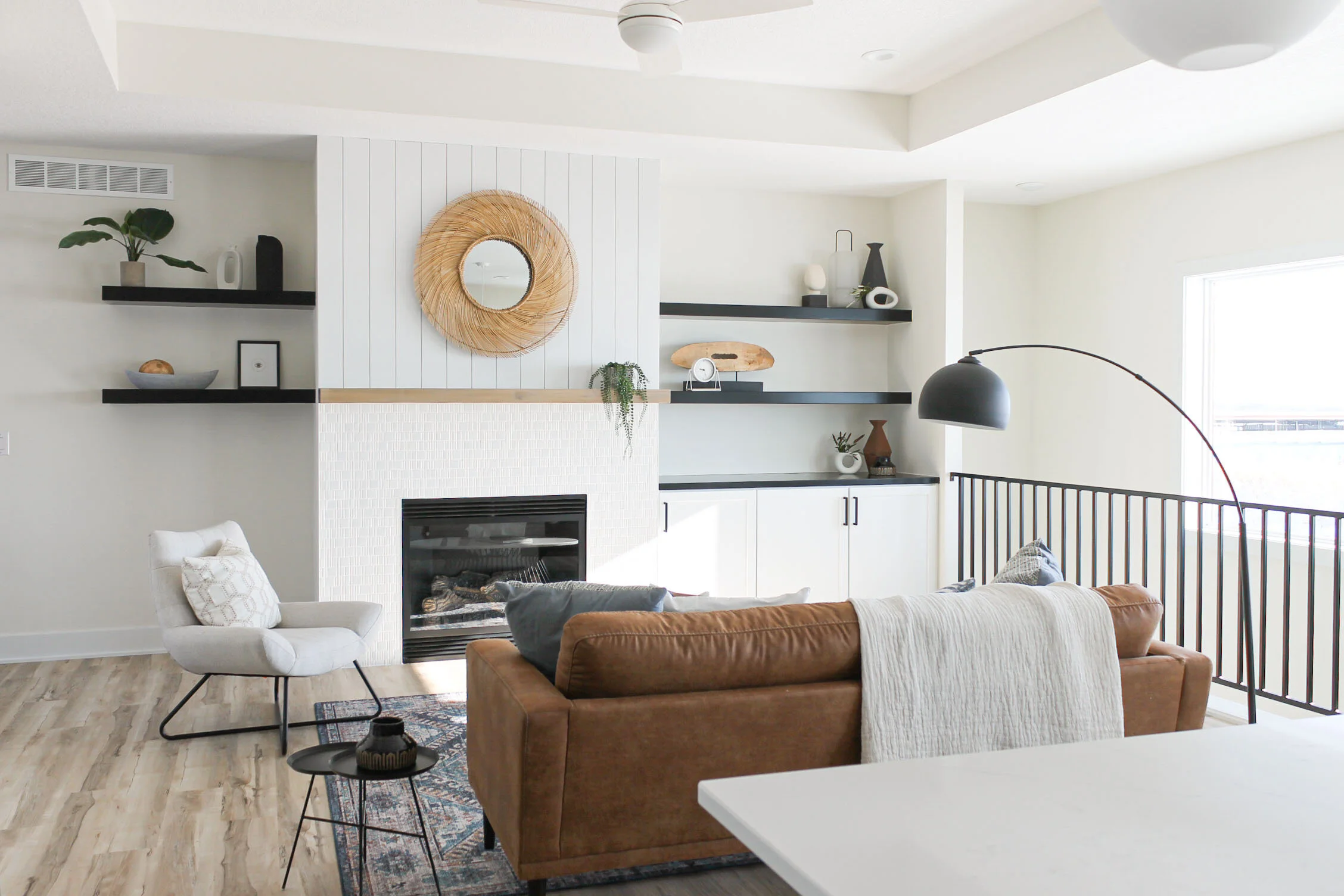
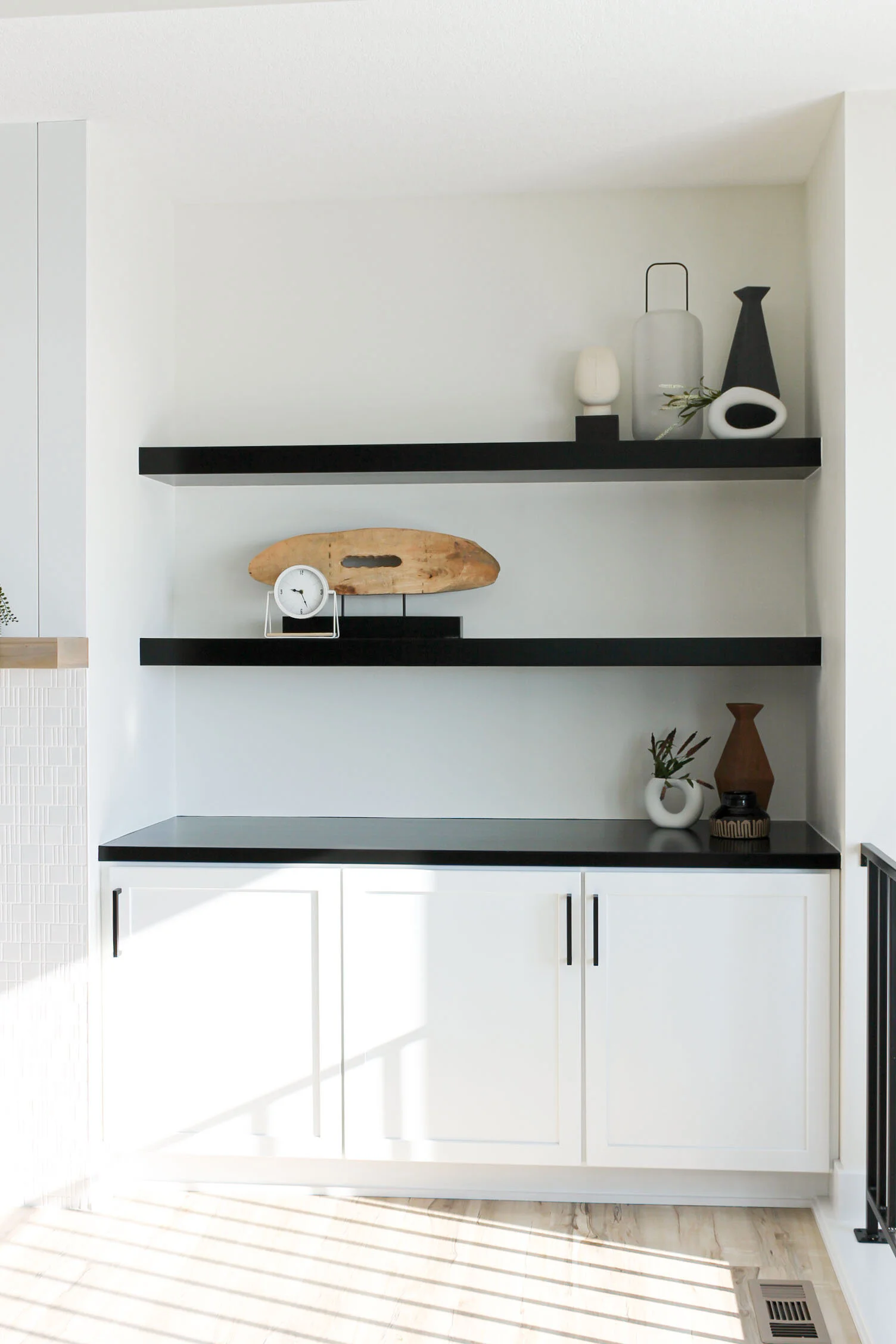
1000 Daybreak definitely has more of a modern design concept. We added some black accents such as the mudroom wall, black shelves in the living room, and we carried the black all the way to the master bath with some high-gloss black shower tile. The kitchen pendants and entryway light fixtures are both two really beautiful modern pieces and we love the juxtaposition of white fixtures with the warmth coming from the Meadowblu woven dining room chandelier. We also added a modern black railing to the main level, which plays into the overall modern feel of the home a bit more.
Inspiration

Color palette
We brought in black as our accent color, with a natural, clean color palette for the rest of the home. Neutral tones elevate the space and help it feel airy and open.
HOUSE TOUR


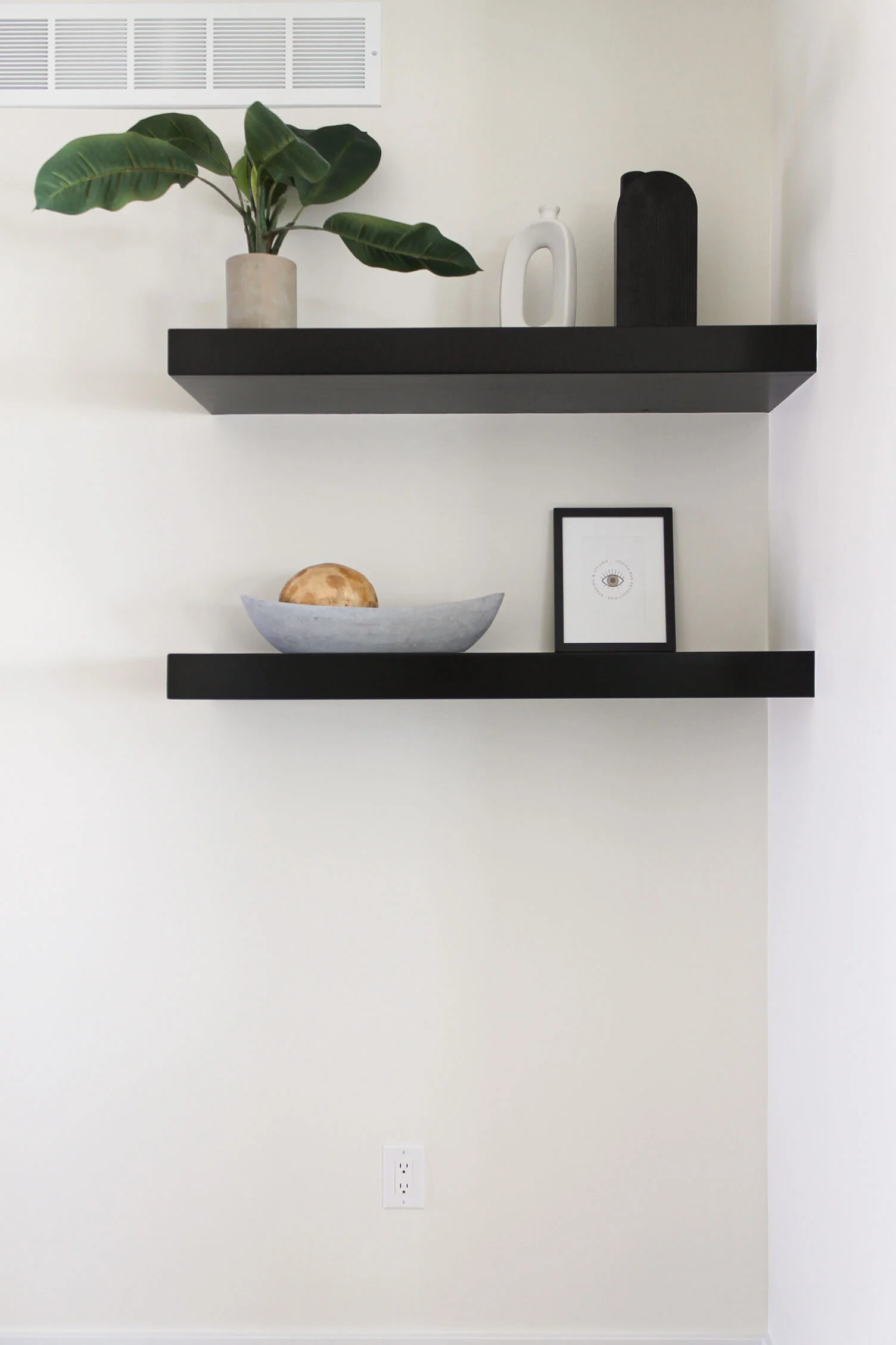
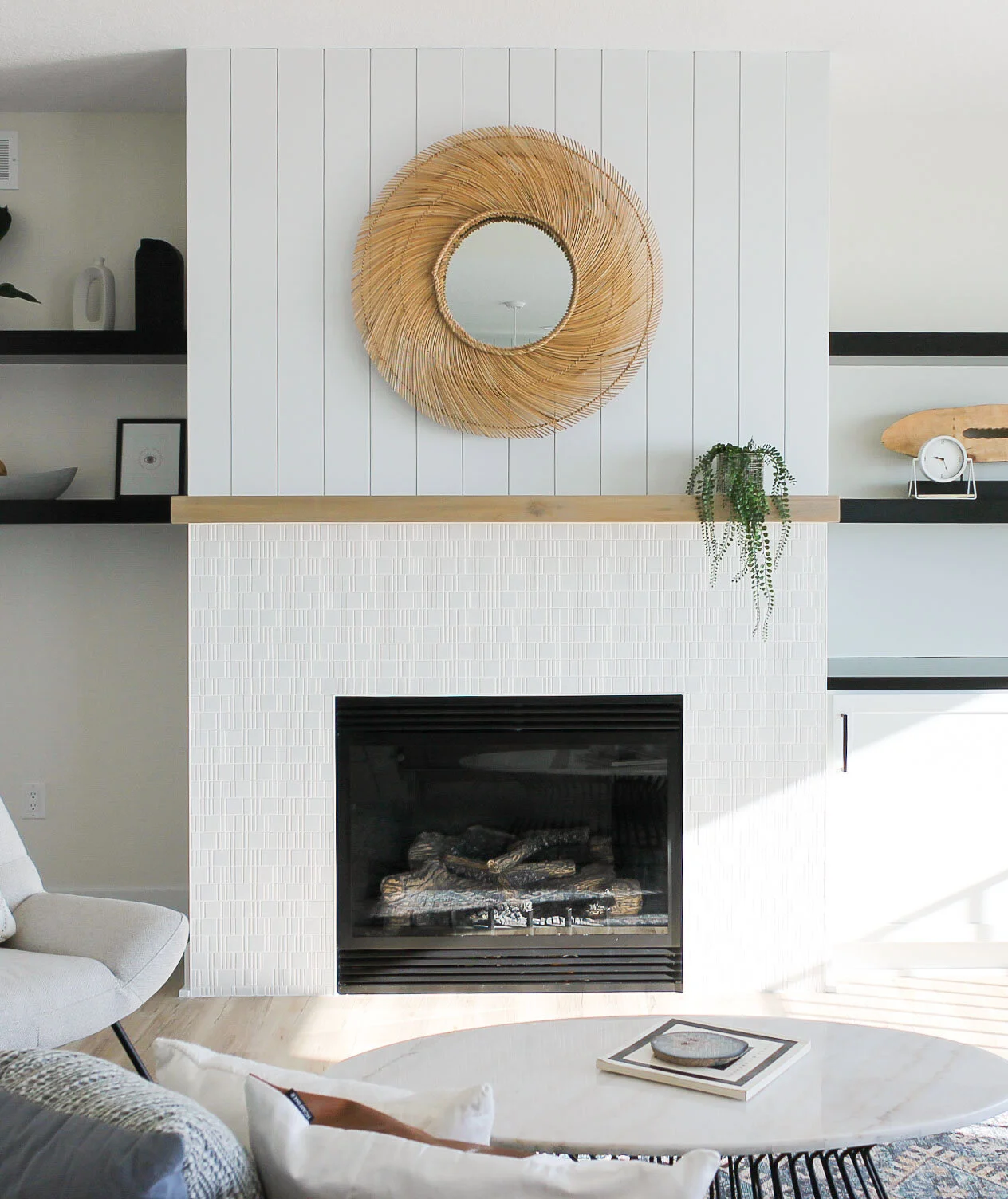

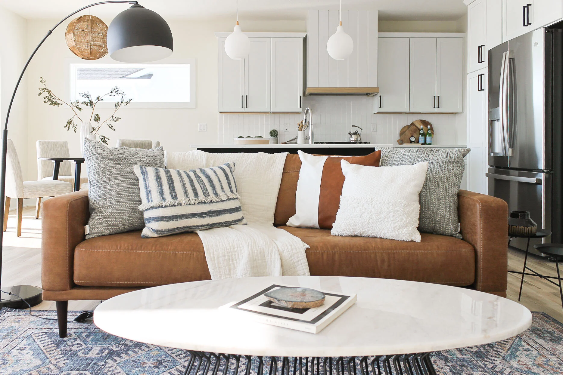


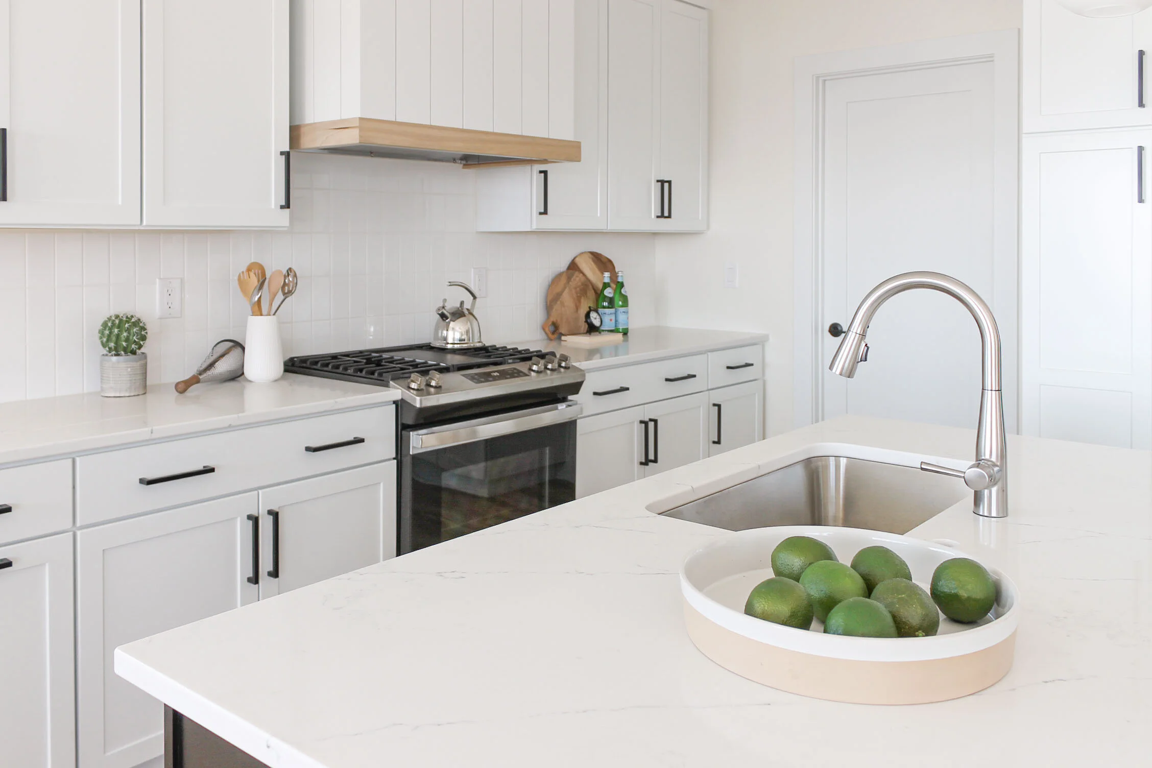
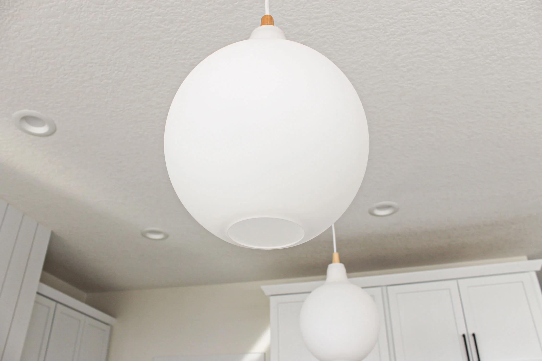
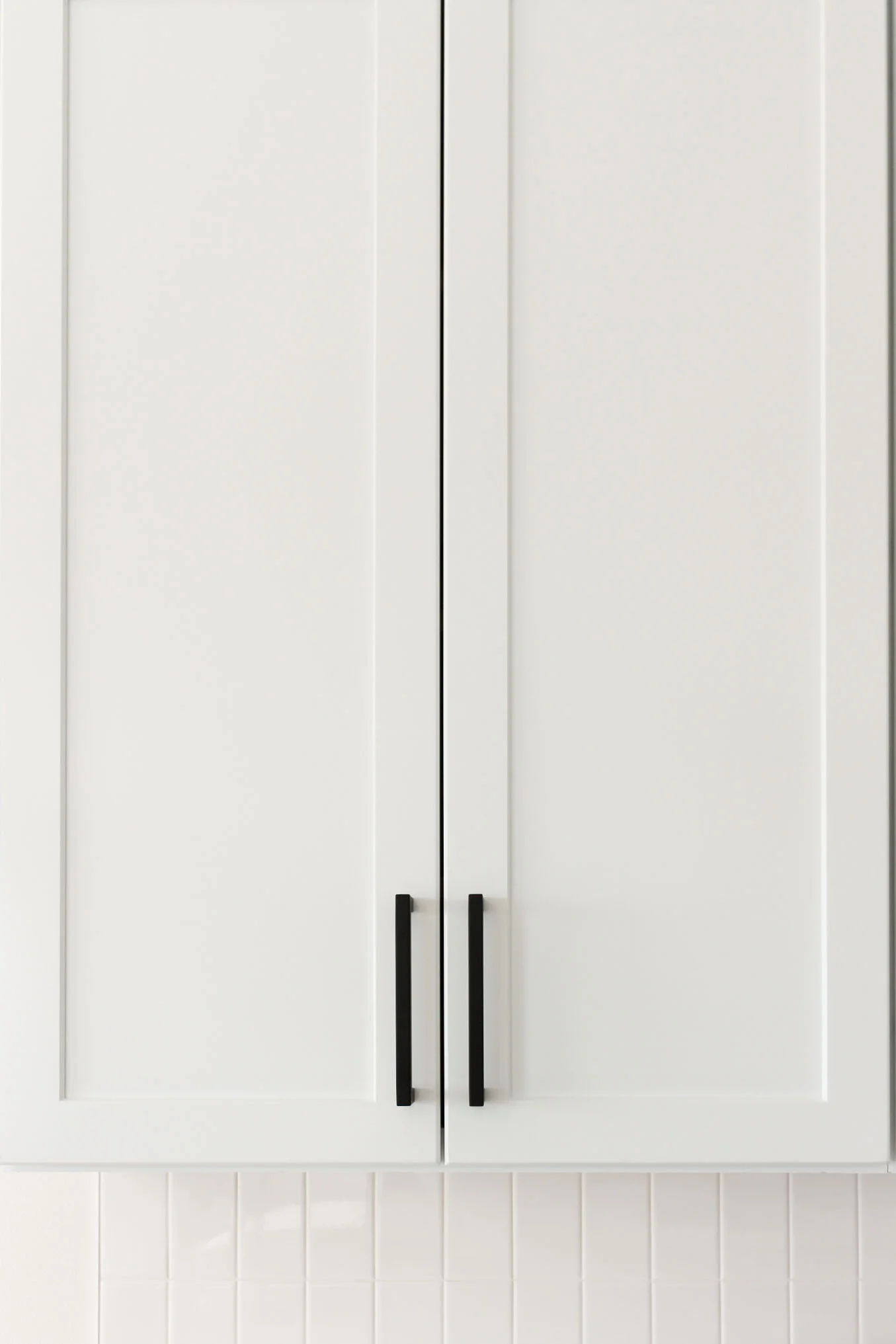

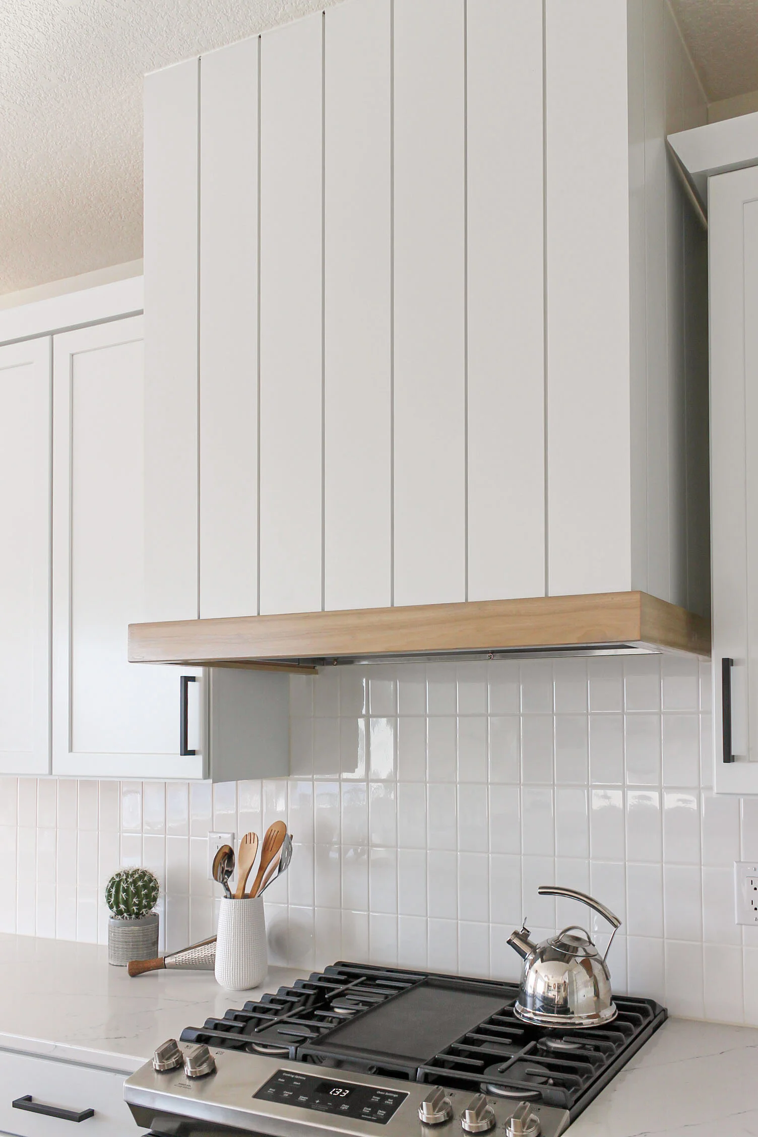

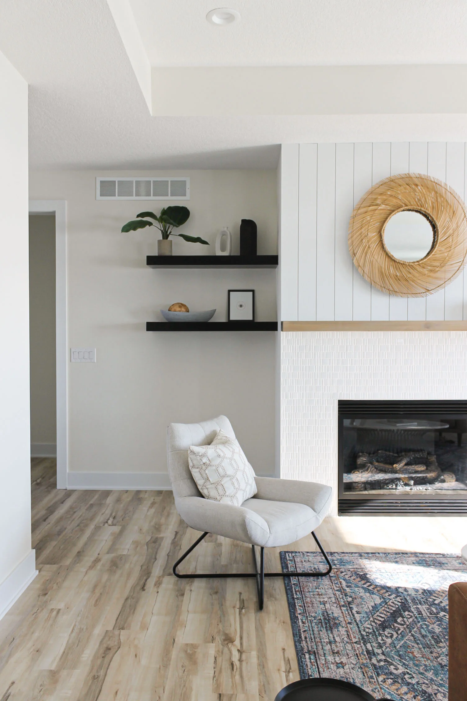
SHOP THE LOOK

1010 Daybreak

1010 Daybreak Before

1010 Daybreak Built-Ins Before

1010 Daybreak Kitchen Before

Intern Sonnie styling built-ins.
Design styLe
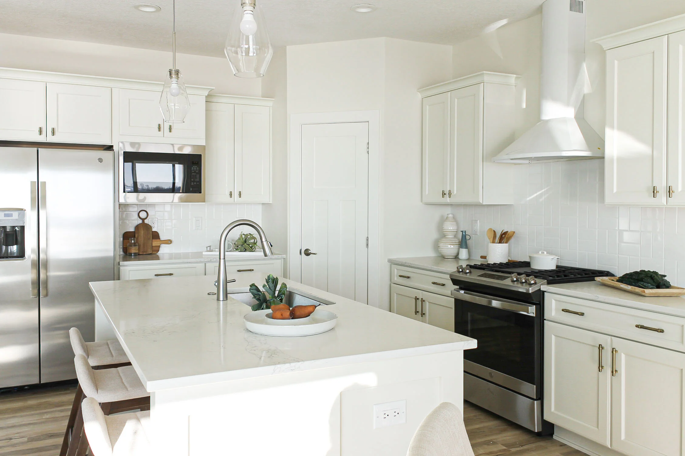
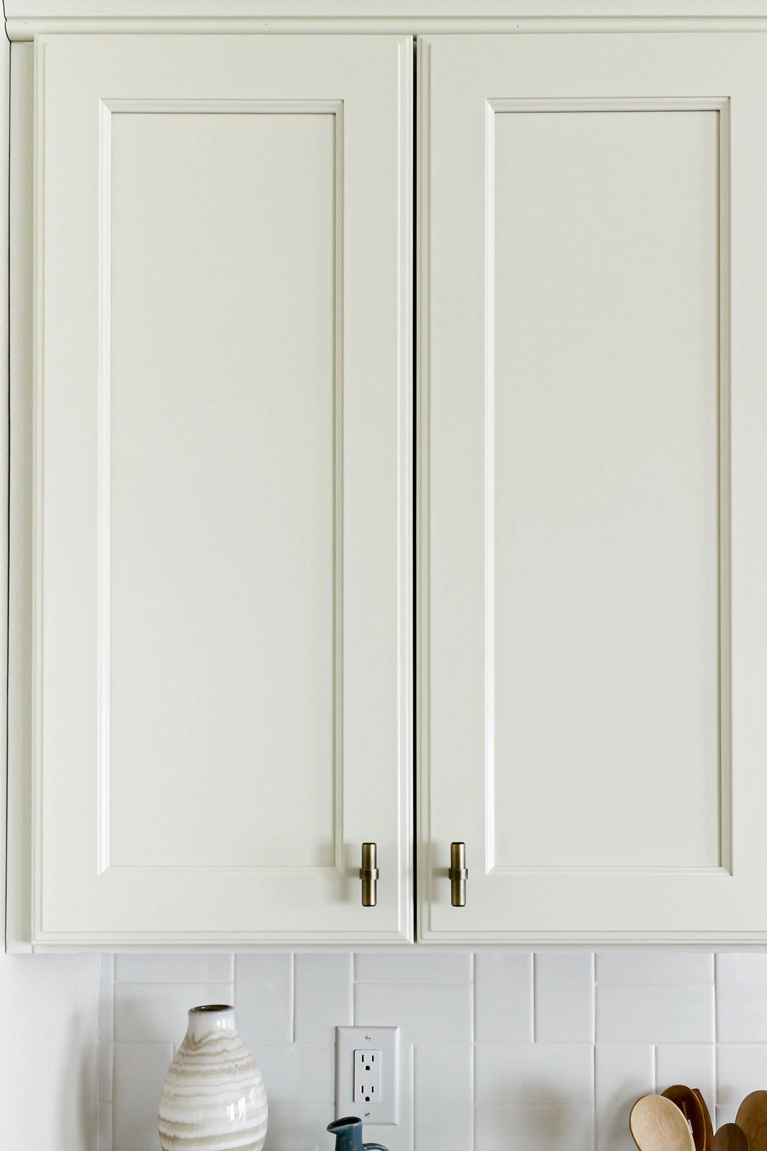
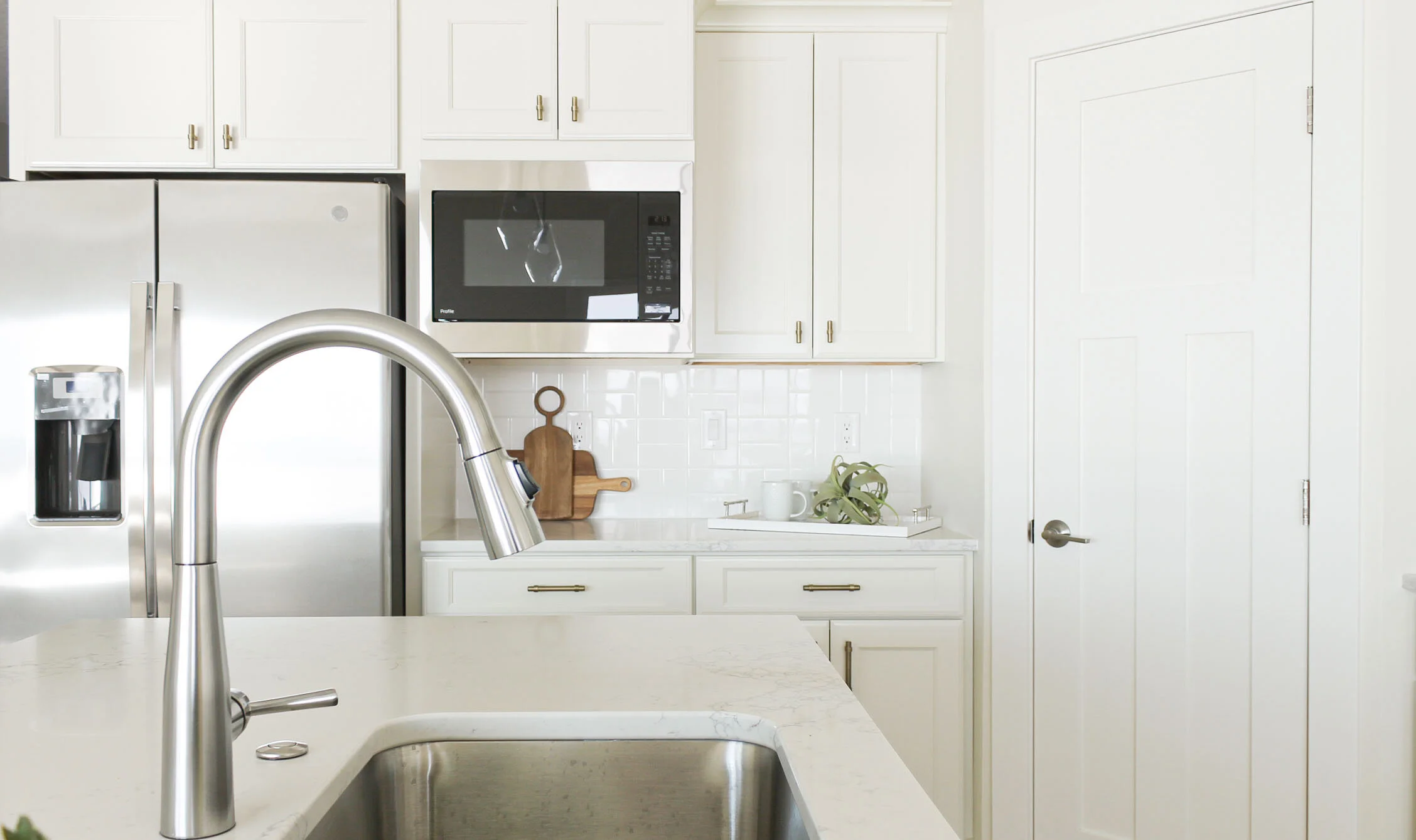
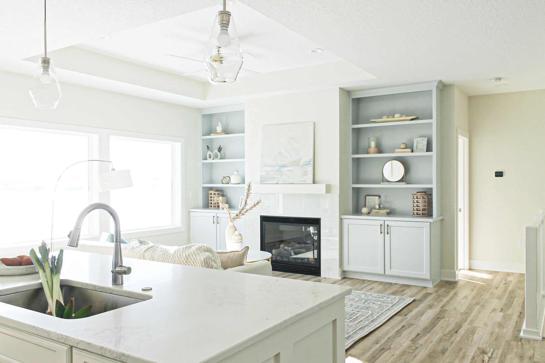
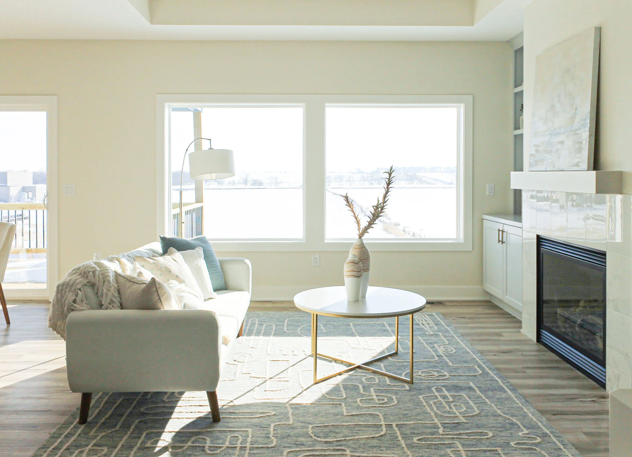
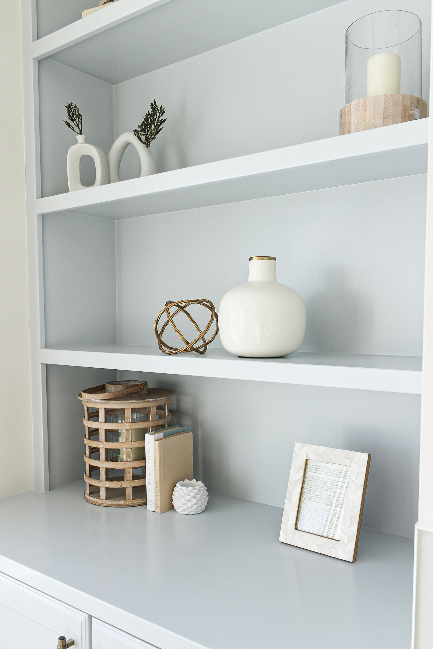
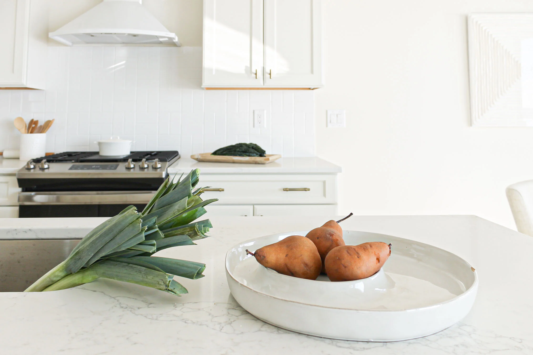
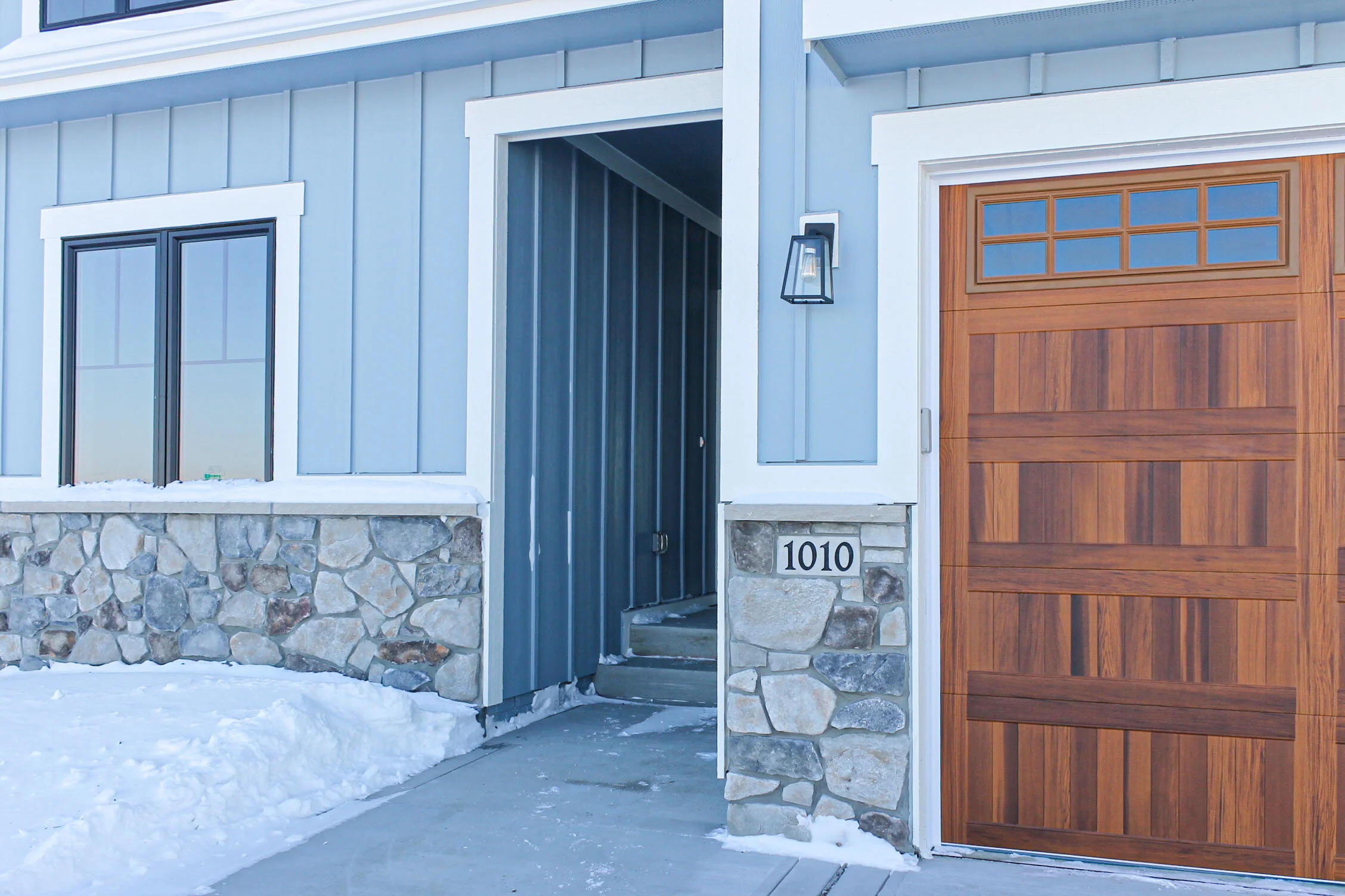
1010 definitely has more of a cottage, beachy vibe. As soon as you walk into the living room, you are greeted by these big windows that let tons of natural light in. The living room built-ins are painted in a light grayish/blue SW Misty 6232, and it just feels so light and peaceful. We did painted wood for the kitchen island and kept the rest of the kitchen design pretty simple. We wanted the warmth from the wood to really shine through.
iNSPIRATION
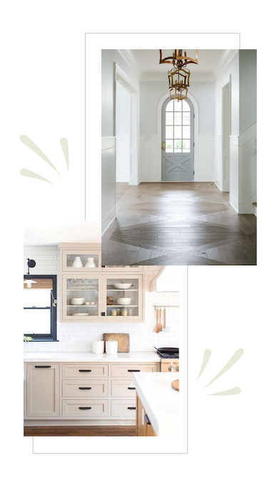
Color palette

HOUSE TOUR
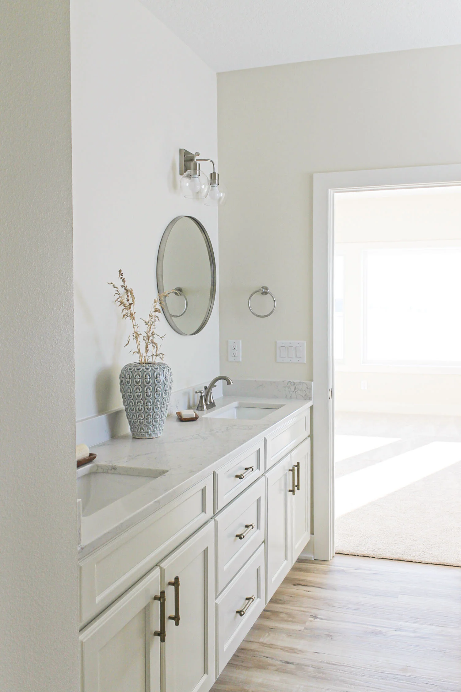
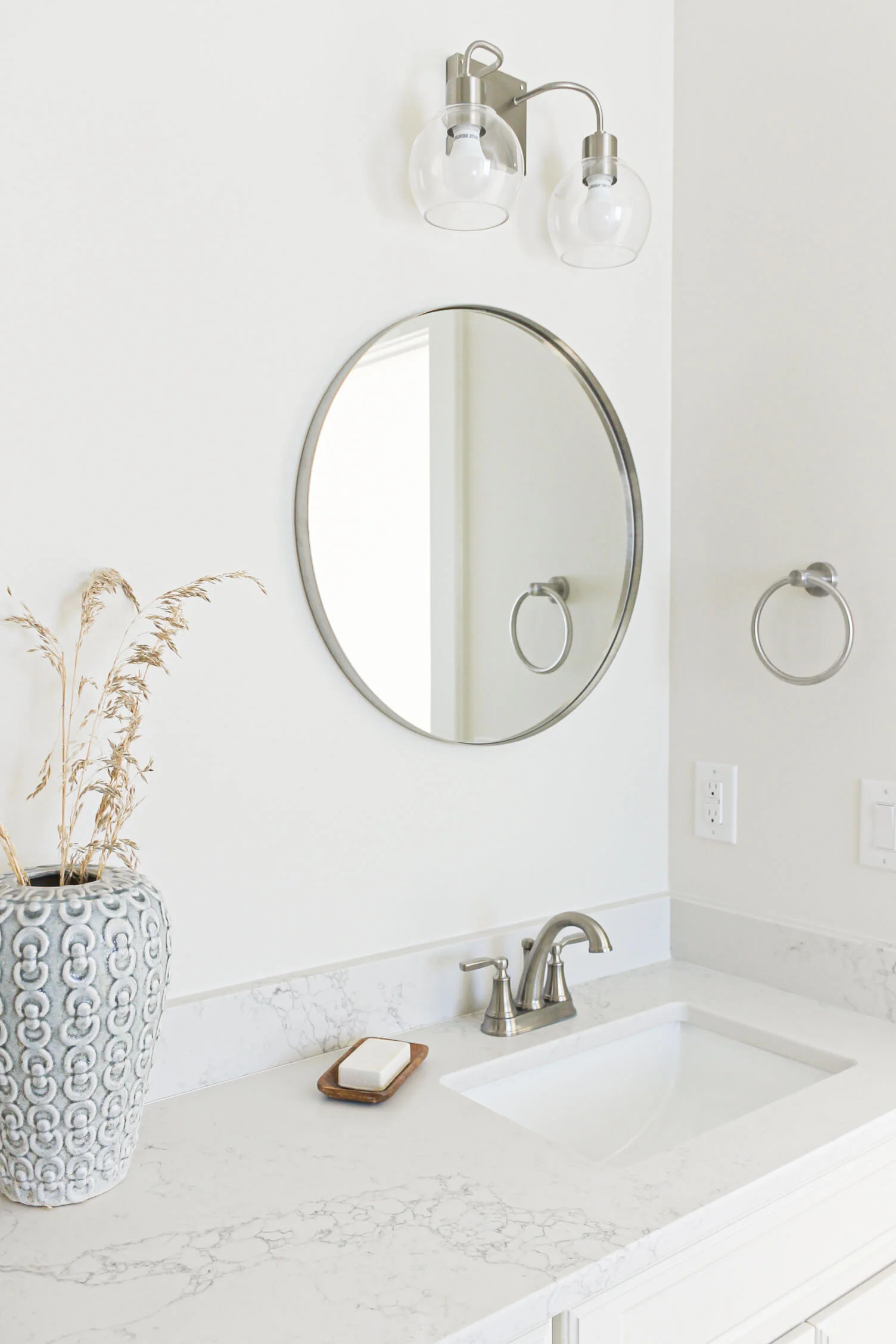
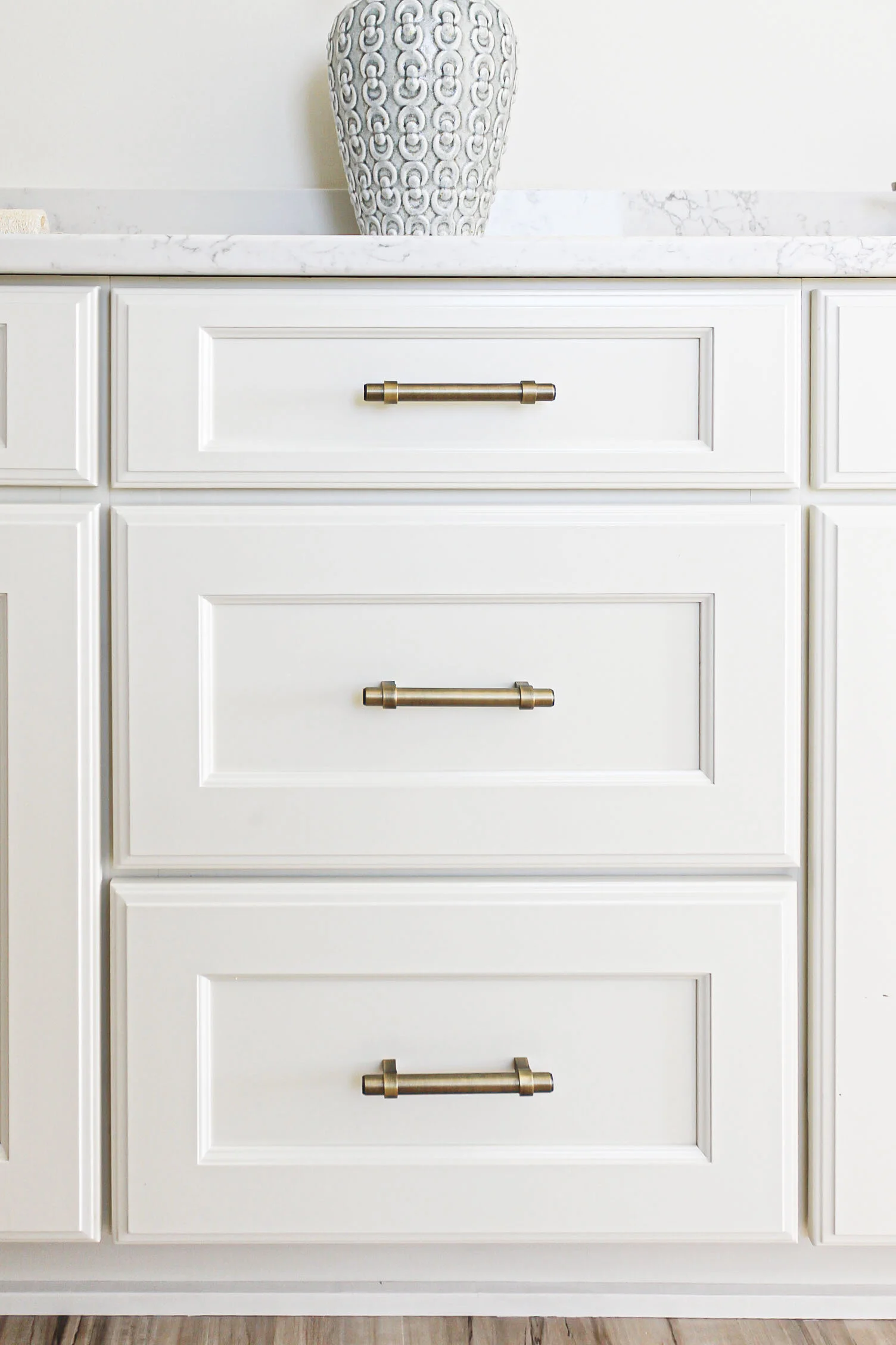
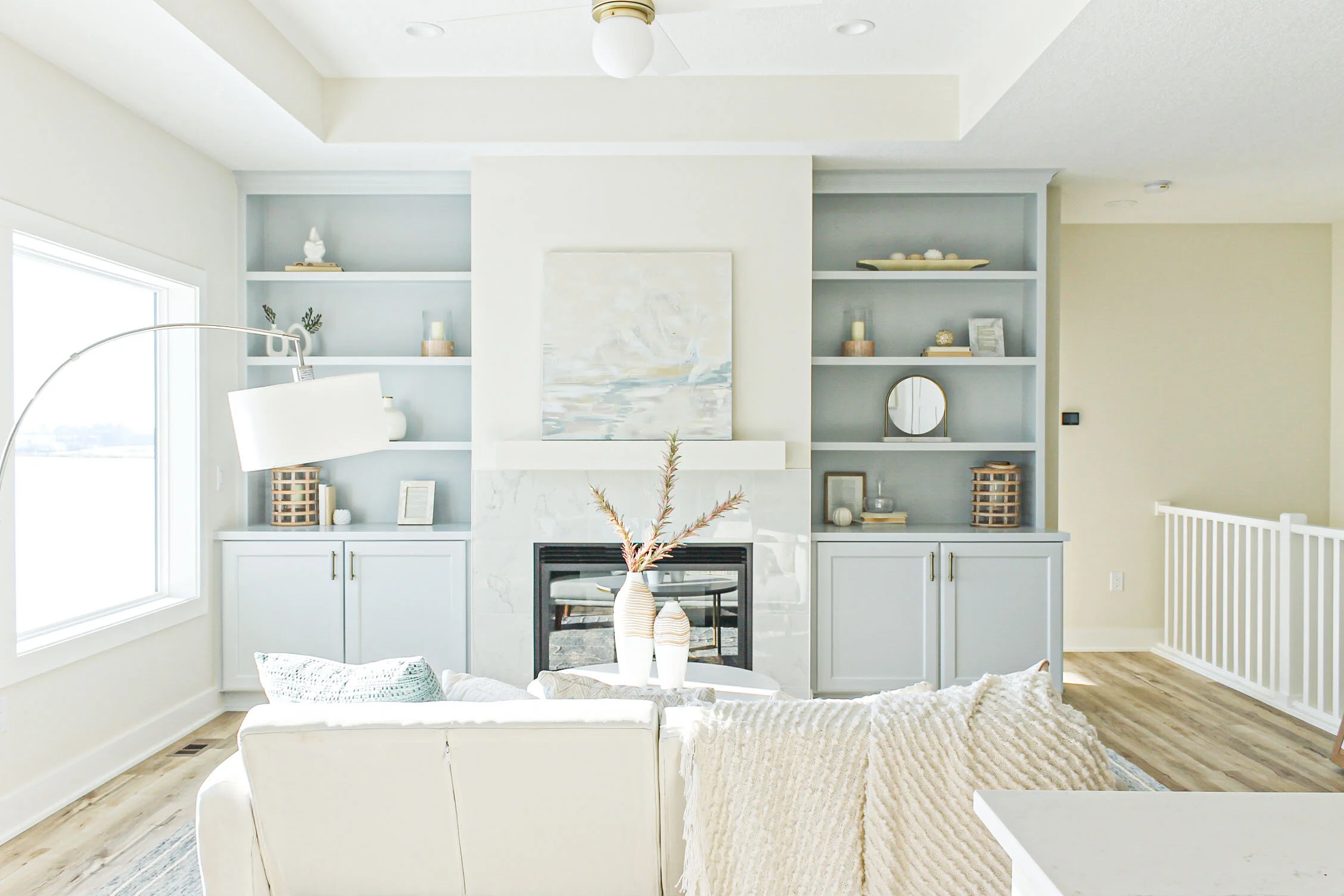
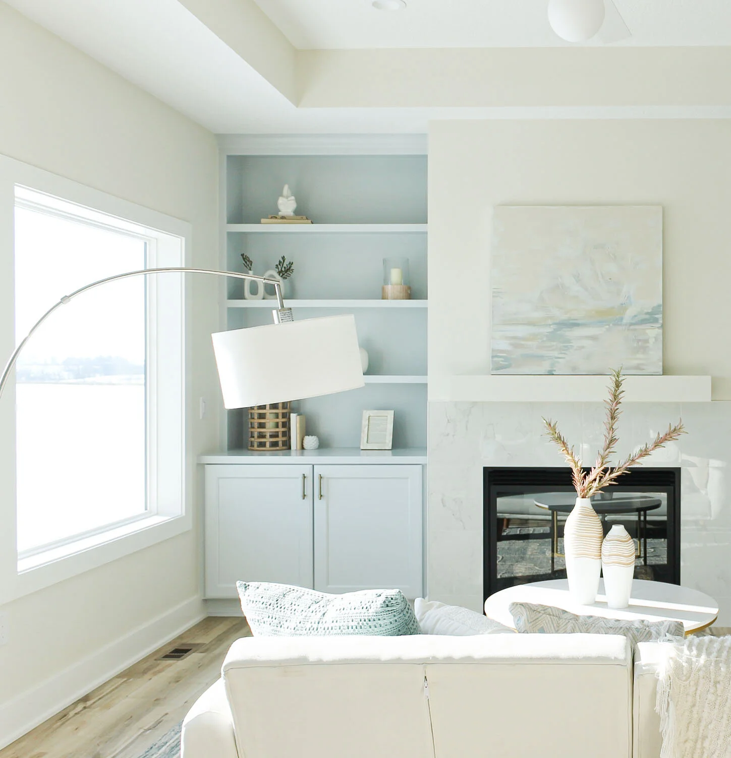

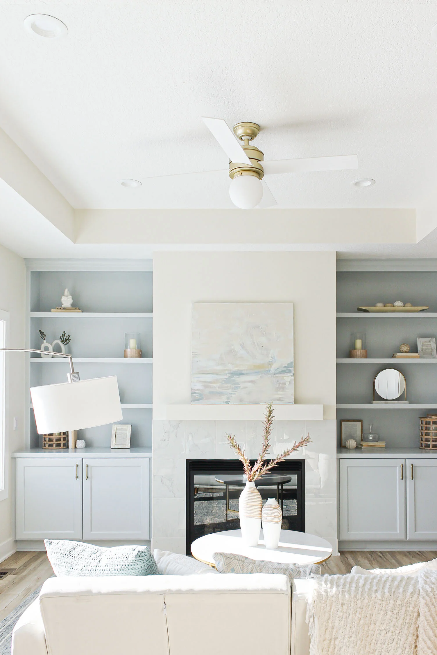
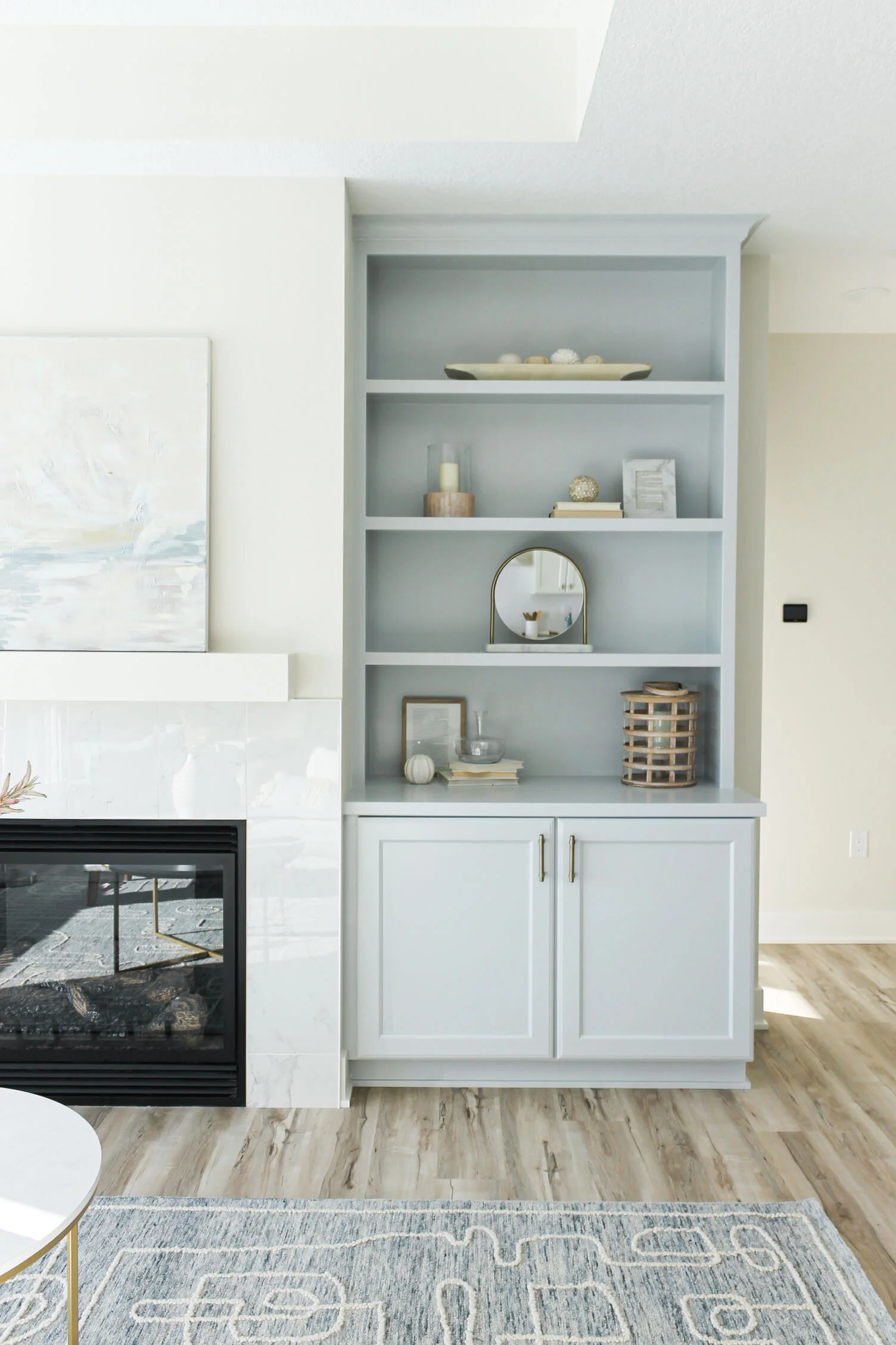
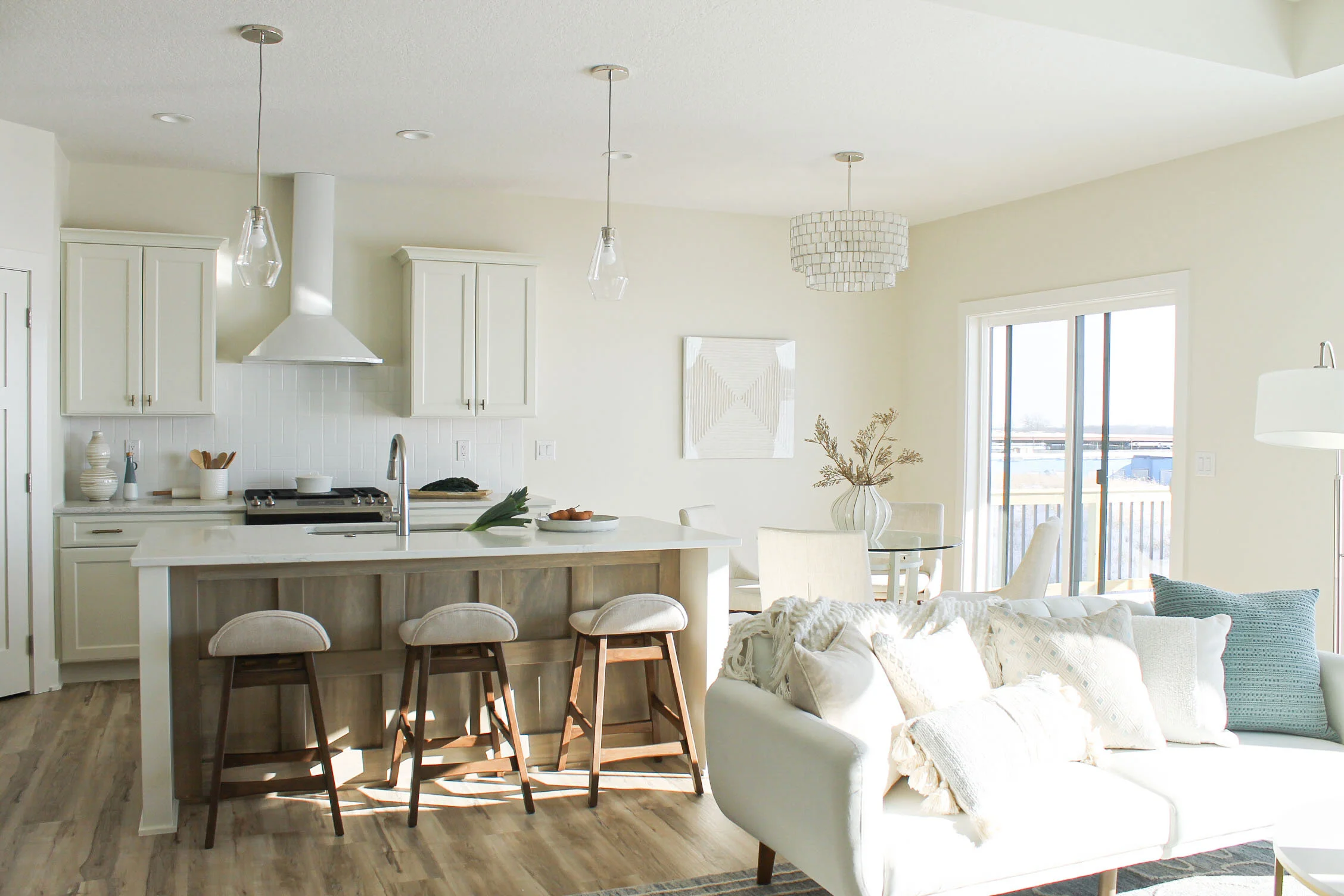
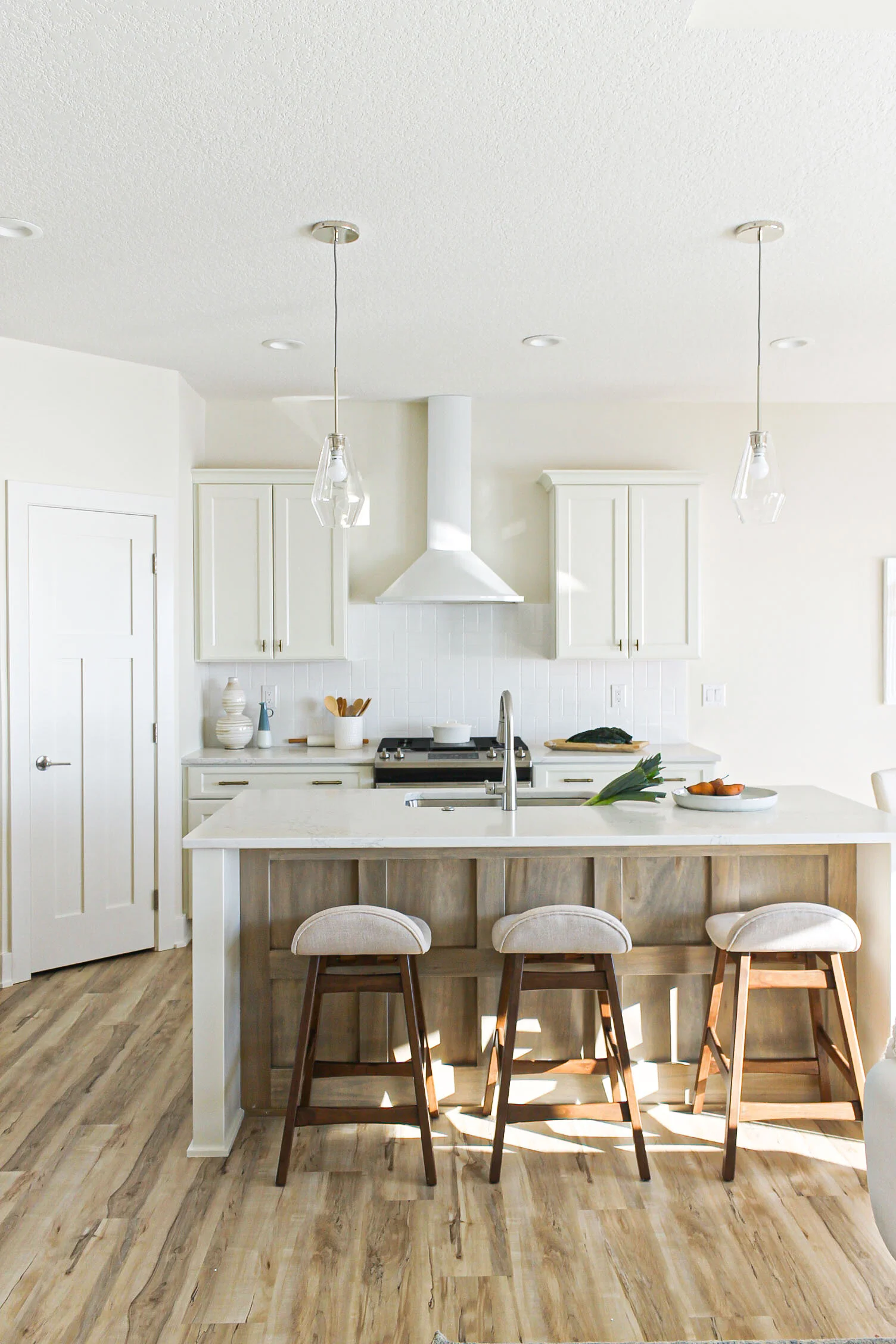
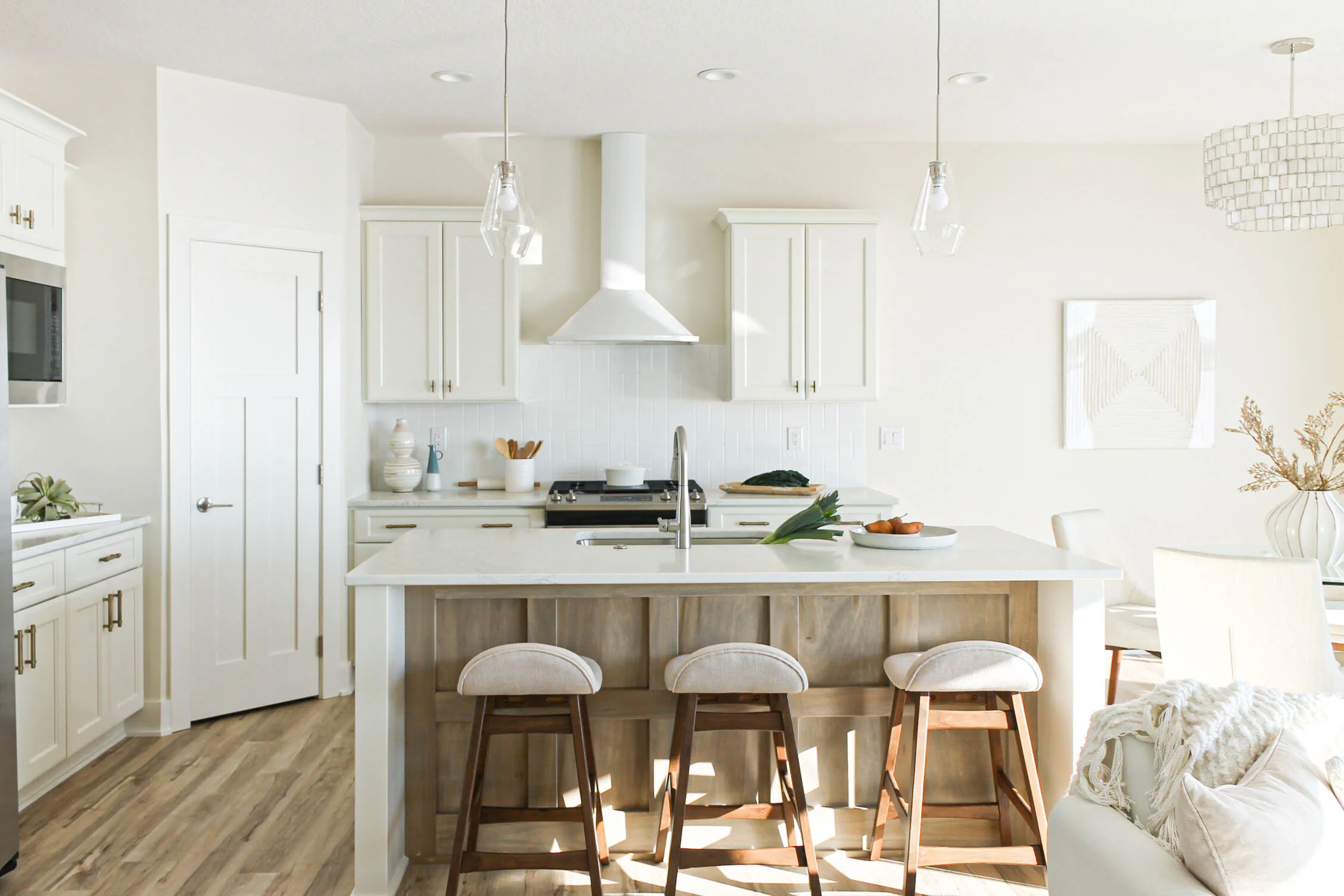
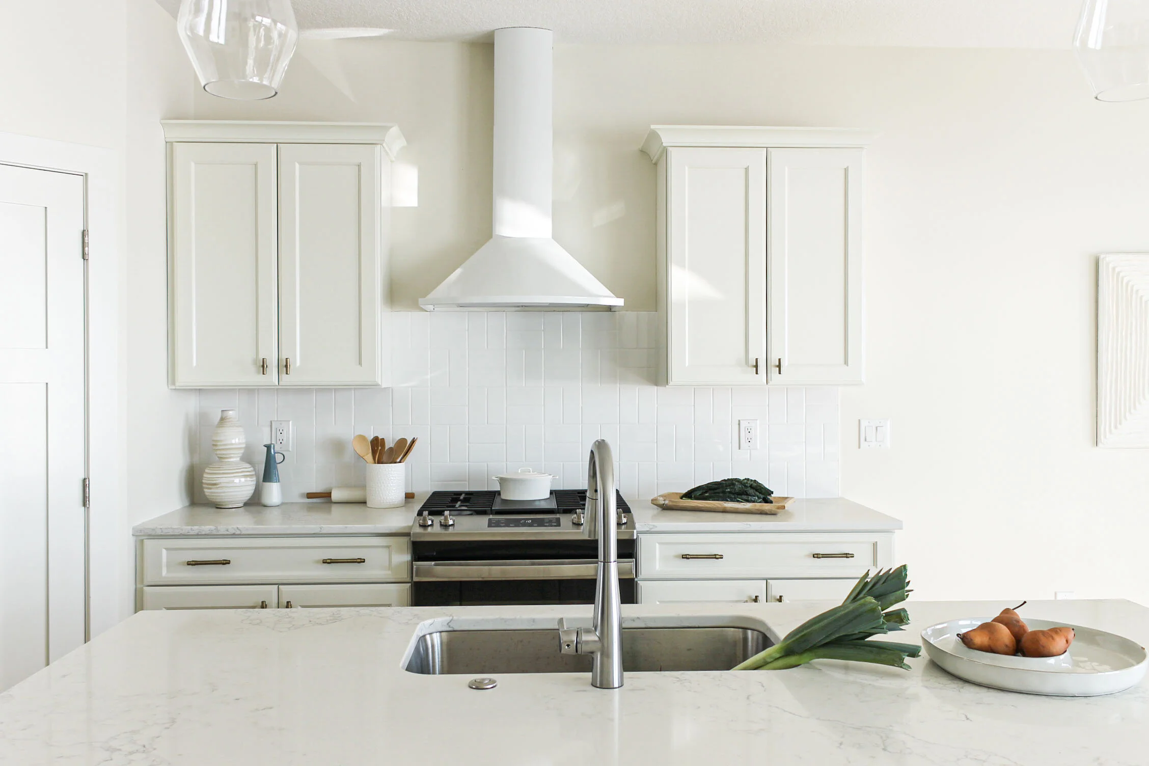
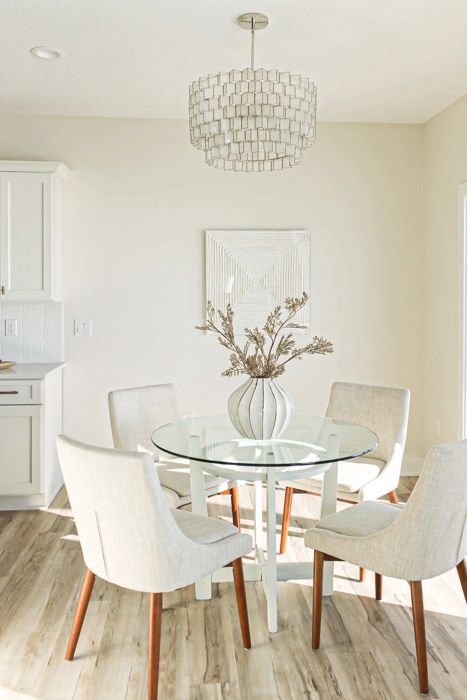


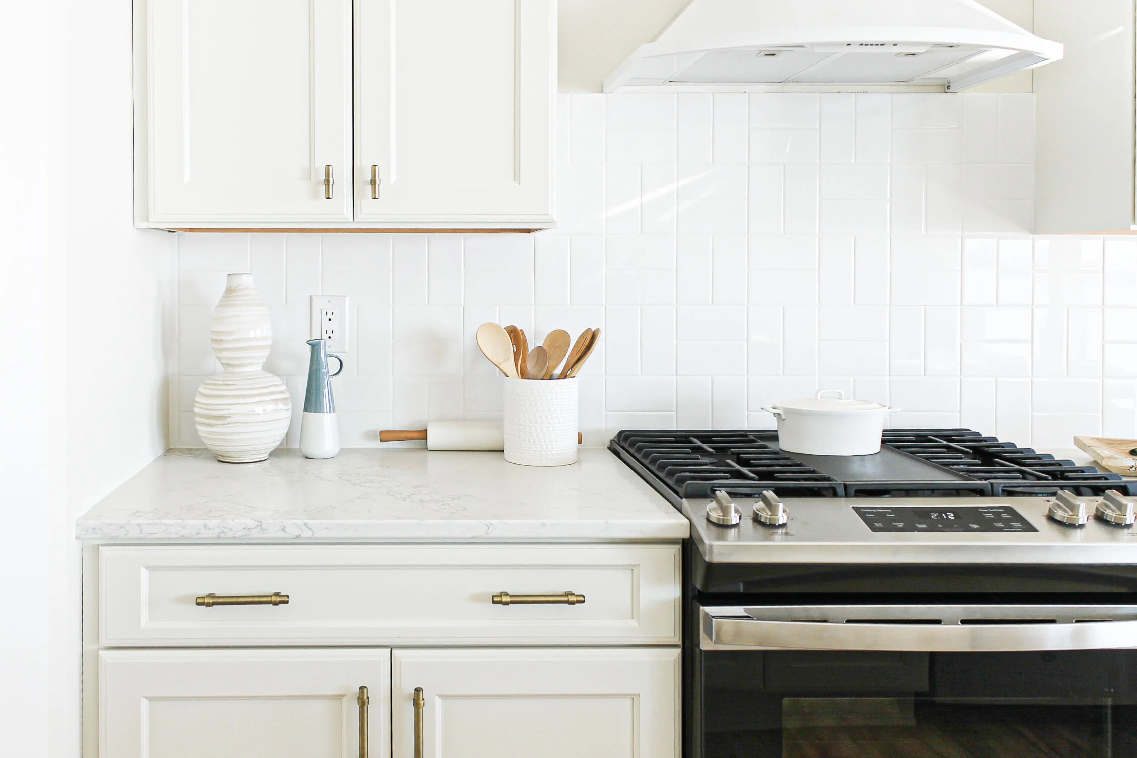

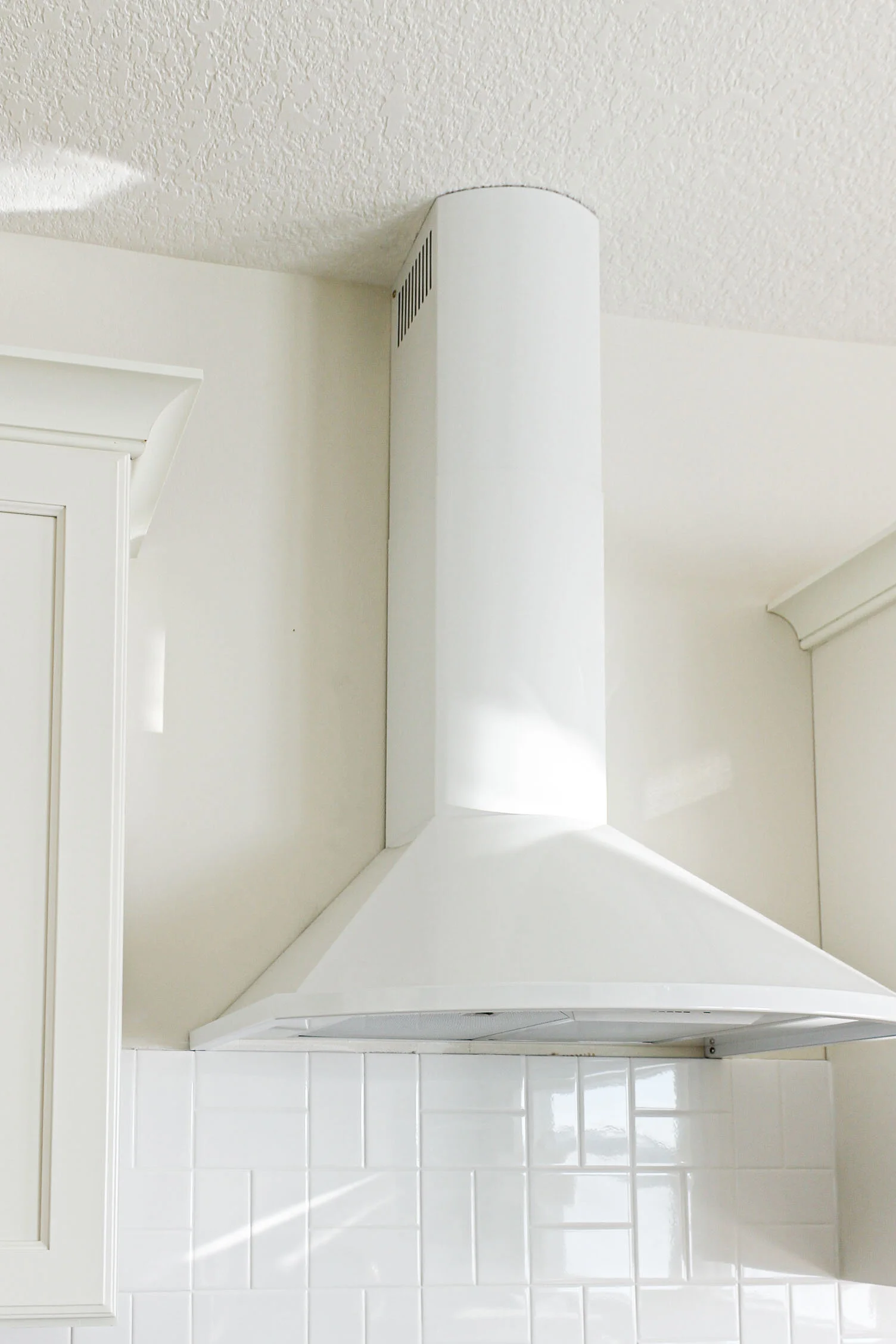
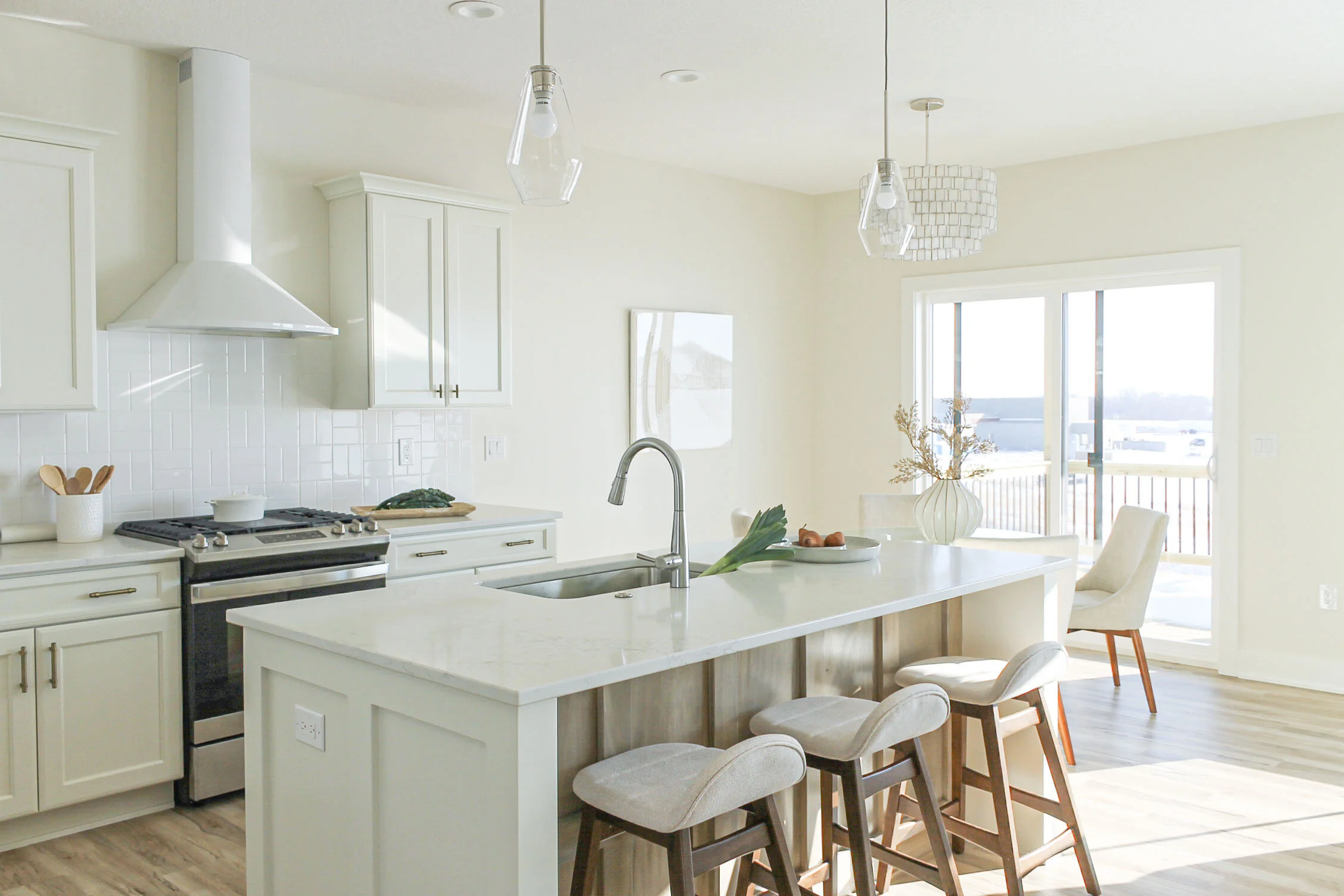
SHOP THE LOOK
Thank you guys for taking the tour! We love being able to share these amazing projects with all of you guys and we look forward to having more of these behind-the scenes content to share in this new year!

Before and After: 2413 Boston Ave
Welcome back to part two of our 2413 Boston Ave before and after project! Last week we did part one where we took a deep-dive into the kitchen and living room remodel. Today we’ll look into the amazing transformation of the rest of the house.
Who doesn’t live for a good before and after? Seeing a space come to life is so exciting, and one of the best parts of what we do. The master bathroom in 2414 Boston Ave is almost unrecognizable now. It was hard to get a good shot of this bathroom during our initial walkthrough, it was so dark and cluttered! But I think this shot gives you an idea of what it was like.


We took out and replaced all the major bathroom fixtures and went with a fresh coat of white paint to make the bathroom a little bit bigger. Combined with the updated floors and gold accents, we have a space that feels totally open and airy!


When you walked into the bedrooms, they felt pretty dark and really outdated. This was a recurring theme for the rest of the house as well. Although we love pops of colors and taking design risks, the green carpet and walls were a major distraction from a space that deserved more.


The first thing we did was remove all the dark trim and doors from all the rooms, including the basement. We added new light fixtures, updated flooring to in the main level, and added carpet to lower. A coat of fresh white paint opens up each level and brings a sense of serenity.


Master


Stairs + Basement before


After

Stairs leading down to the basement got a pretty statement paint to tie in the pops of color throughout the house!


Exterior before + After


Thank you for taking the tour! We’ll be back next week with another awesome home reveal, so be sure to stay tuned.